Posted on 20 Comments

What’s New in Topaz Studio 2

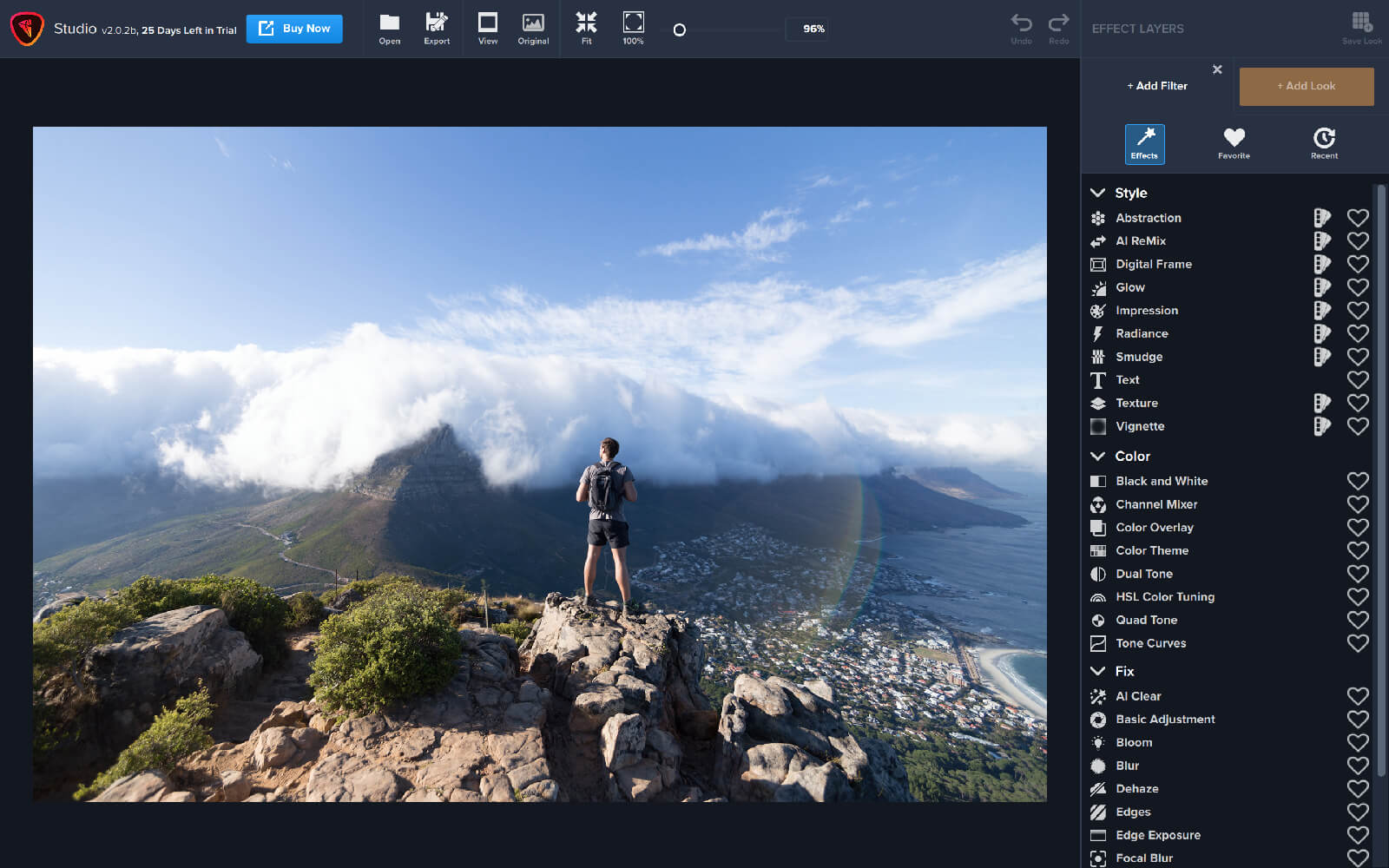
Two weeks ago, we released our latest product, Topaz Studio 2! The release plan was to get the amazing features of Topaz Studio 2 to our customers, while following fast with additional features and improvements. Over the last two weeks, we’ve held to that commitment and released 7 updates that included the planned features as well as improvements based on invaluable feedback from our customers. We are excited about what we have accomplished together thus far in such a short period of time! Our team is committed to continuing to add features, enhance, and support Studio 2 and it’s users. Check out the progress that has been made since the product’s release:

Additions:

  • Crop / Rotate / Straighten
  • Resizing
  • Studio 2 Project Files that complete save and return you to your workspace
  • Histogram
  • Filter Level Presets including the ability to add your own
  • Image Navigator
  • Search by Name in AI Remix, Texture, and Digital Frame
  • Tools Menu for quick access to Histogram, Crop, Navigator
  • Copy and Paste Masks between layers
  • Complete Texture Management

Improvements:

  • Ability to Save Studio 2 Project while in Photoshop or External Editor modes
  • Textures now have names
  • Masking UI Improvements
  • Updated UI in Filter control panels to not clip top control
  • TS1 Custom and Favorite Effects can now be converted to TS2 My Looks
  • Add Filter Panel now remembers last viewed state (Filters, Favorites, Recent)
  • Add Look Panel now remembers last viewed state (category, sort, thumbnail size)
  • The “+ Add Filter” Menu has been restyled to make the categories more prominent
  • Layer mask now has blue border when it’s selected
  • Hovering over textures no longer changes preview

Fixes:

  • Fixed issue preventing tiff files from opening on windows machines
  • “+ Add Look” menu defaults to “All category”
  • Fixed update screen
  • JPEG export no longer dramatically reduces image size and quality
  • Fix crash when applying recently used Look
  • Studio 2 no longer replaces Studio 1 in PS Filters menu (“Topaz Labs -> Studio 2”)
  • Default export filename suffix is now “-studio”
  • Improved undo/redo consistency 
  • Textures, AI Remix, and Digital Frame assets were restored
  • Exporting to JPEG format no longer results in extra .jpg in the file name
  • Fixed the Lightroom Classic External Editor workflow
  • Remember chosen export path within the session
  • Application now warns when your image has been modified and you are trying to: 
    • Open an image
    • Open a recent file
    • Close an image
    • Drag and drop an image
    • Exit the application
  • Initial colorspace for JPG/JPEG files is now sRGB (once changed, it will be remembered going forward)
  • Glow filter Primary Detail Strength no longer removes the effect of other filters

Not only has our product team worked diligently over the last two weeks to bring these improvements to Studio 2, we’ve also shared our road map to let you know where this product is going. There’s a lot of improvements and new features on the horizon that we can’t wait to share with you. Here’s a little taste of what’s to come:

Coming Soon:

  • Plugin Support for Topaz Products
  • Heal
  • Image (pixel) Layers for Compositing
  • Improved Wacom Tablet Masking Support
  • Enhanced Masking Experience
  • User Interface update on the individual Filter Panels
  • And much, much more!

We cannot thank our users enough for providing invaluable feedback during these early days of this revolutionary product. We can’t wait to share more of Studio 2 with you in the months to come.

-Topaz Team

Posted on 11 Comments

Tutorial: How to Create a High Contrast Black and White Effect in Topaz Studio 2

There’s nothing quite as captivating as a dramatic black and white image. It can turn a simple photo into an eye-catching masterpiece. Some assume this process can be made simple by simply turning your photo Black and White. But there are a few more steps to take that can really make your black and white image pop.  In this tutorial, we will walk you through that simple process and show you how to create a high contrast black and white image in Topaz Studio 2 using three essential filters: Black and White (of course), Precision Contrast, and Precision Detail.

Step 1: Black and White

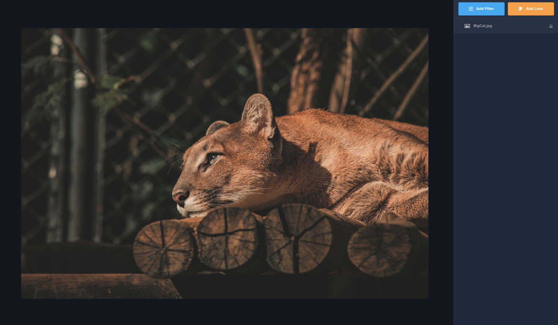
We’ll start off by opening our image in Topaz Studio. From the beginning, you’ll notice that the image is a little dark and a little muted. This shadows in this image will benefit us later on to create a striking difference between the big cat and his background.

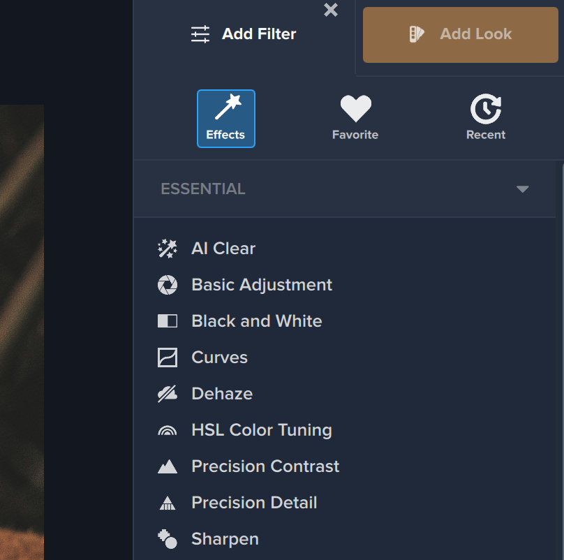
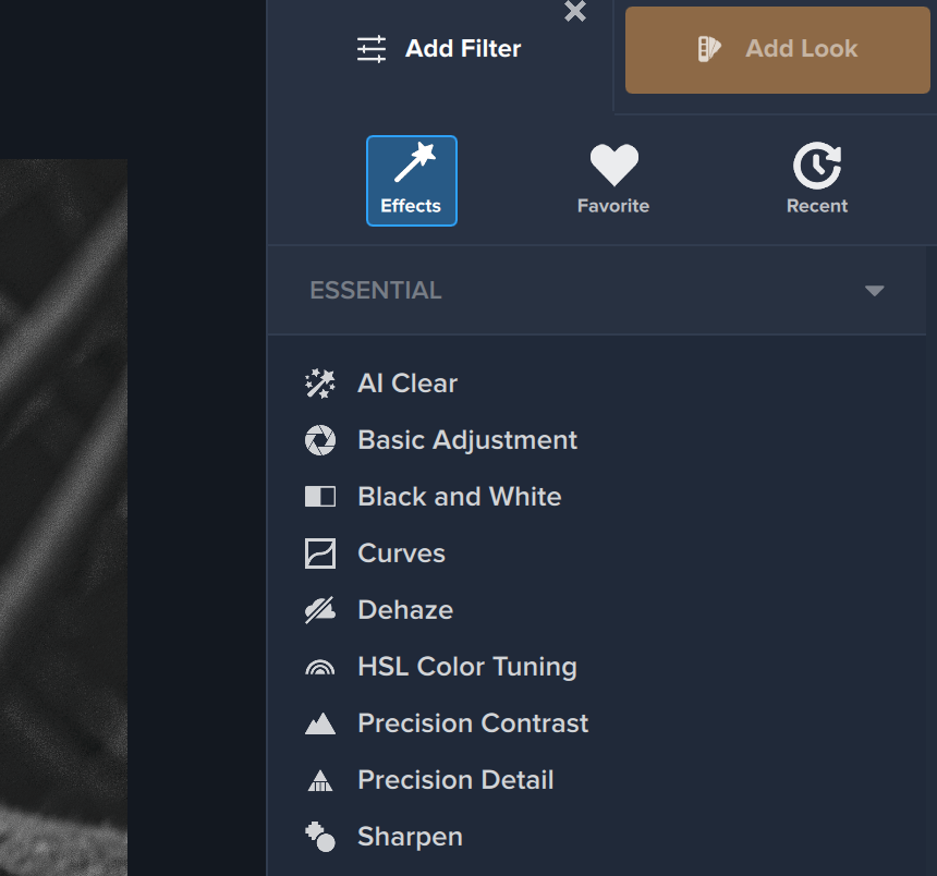
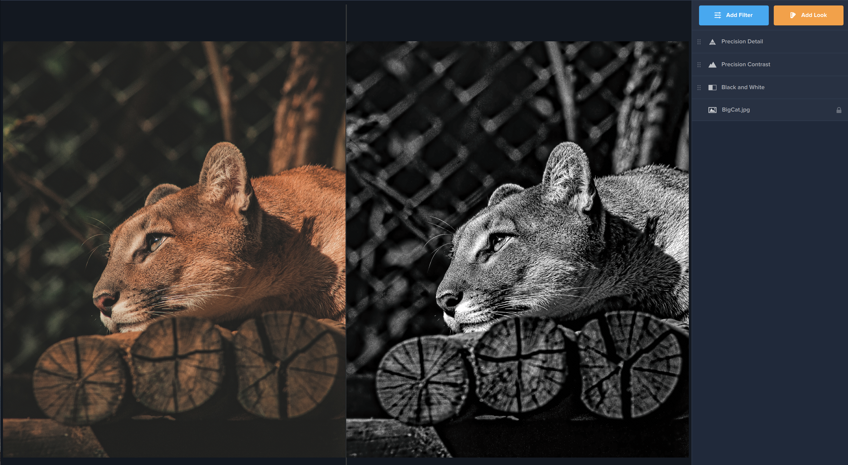
The first thing you’ll want to do is click the blue Add Filter button in the right-hand menu. This is where you’ll find over 30 unique and customizable filters to use on your image. The first filter you will select is Black and White in the first category of filters: Essential.

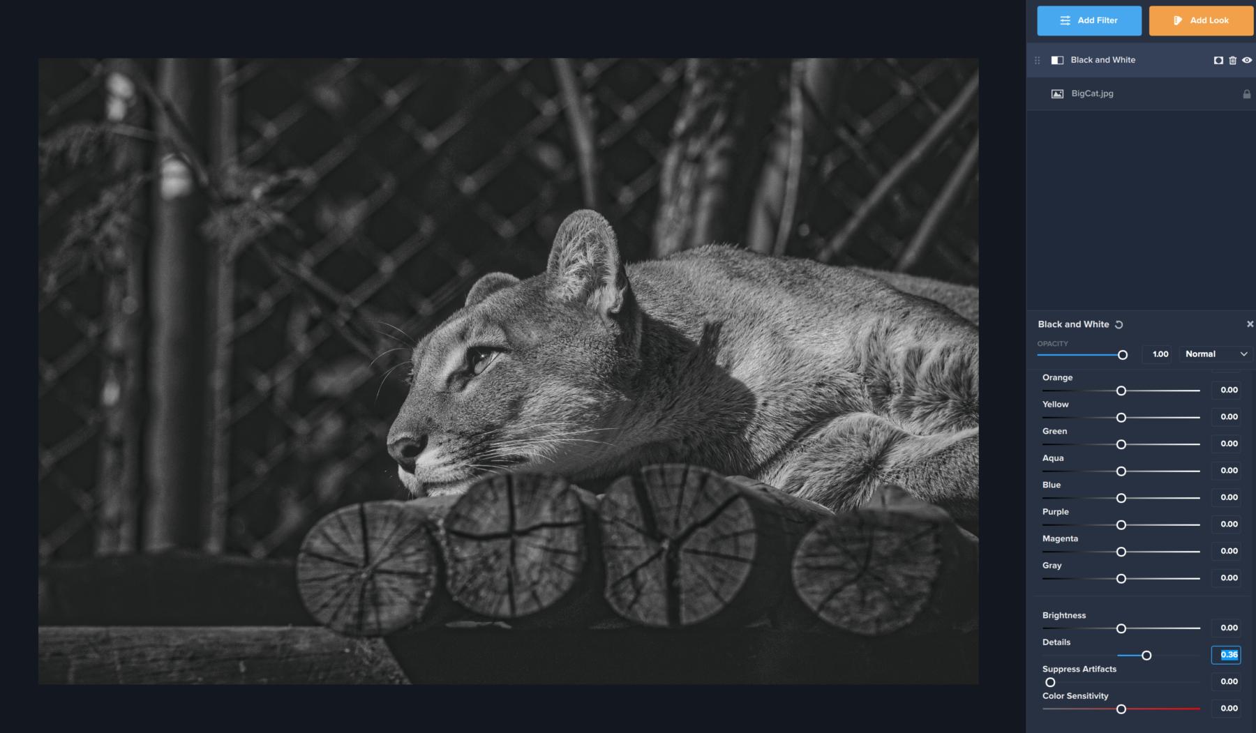
We’re actually not going to do much in this Filter today, though if you have a high concentration of a single color in your image (blue, for example) we suggest you play around with the color sliders in the filter to see how they affect your image. For us, this Filter serves a simple purpose: to turn our image black and white. We did alter one slider, the “Details” slider” near the bottom of the filter. We wanted to bring out some of the detail in the lion’s whiskers and fur before we moved on to our next step.

Step 2: Precision Contrast

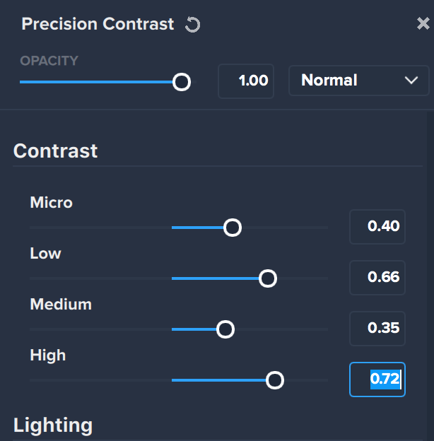
The second filter we will apply is also in the Essential category – Precision Contrast. (Pro tip: simply click the blue Add Filter button again to add a new filter!Once we applied Precision Contrast, we adjusted a few sliders, starting with the sliders under the Contrast section. You’ll notice we adjusted all four sliders (Micro, Low, Medium, and High) by different amounts. These sliders affect all images differently depending on the composition. We encourage you to play around with these sliders to see what’s right for your image, as each image has different levels of light and contrast.

The easiest way to bring out details in the cat as well, as darkening the background and shadows beneath the logs, was by adjusting the Low and High contrast settings, but we also liked how the Medium and Micro settings adjusted the rest of the image: the patterns in the wood, the chain link fence, and the shadows on it’s fur.

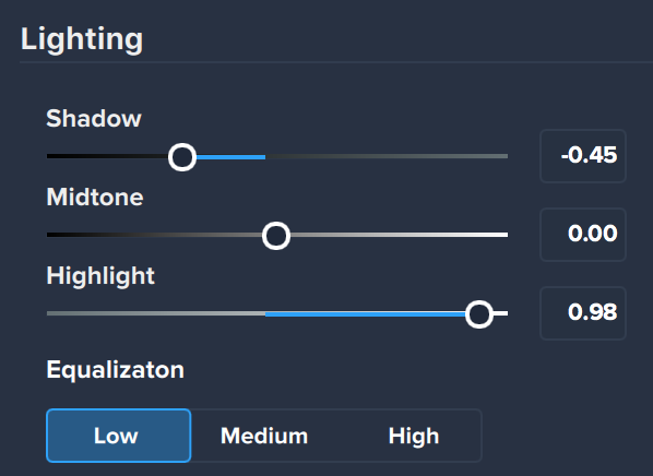
 Next, we adjusted the sliders in the Lighting section. We left the midtones alone because they made the fur a bit too sharp, but we moved the Shadow slider down to darken the already dark areas, and brought the Highlight slider way up high to bring out the highlights on the fur. It created a stark effect where the big cat stood out from it’s surroundings. Lastly, we moved the Equalization tab to Low in order to remove some of the busyness from the background of the image.

Step 3: Precision Detail

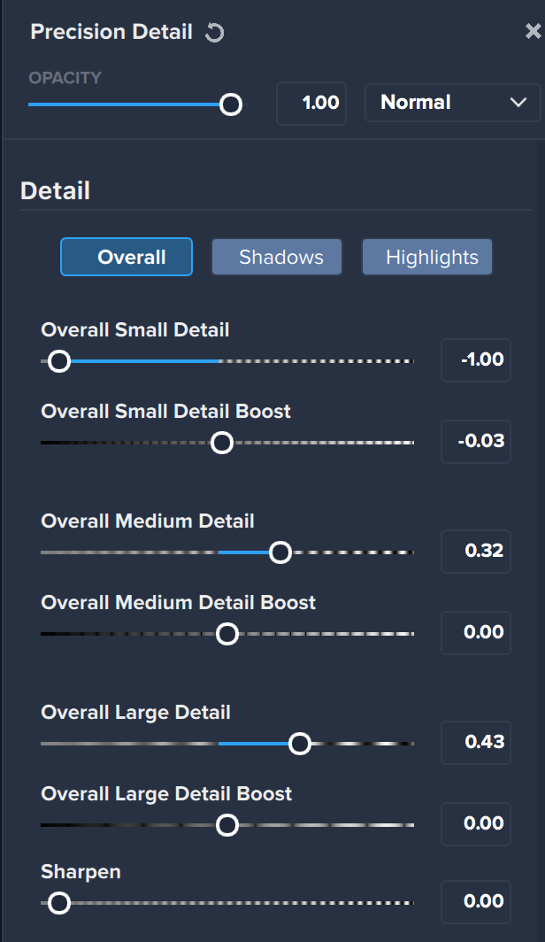
Our final filter that we applied was Precision Detail. This filter is also in the Essential category under the Add Filter menu. We liked the levels of light and contrast in our image but wanted a little extra detail to stand out in the lion specifically. Once we applied the filter, we only made a few small changes. First, we moved the Overall Small Detail slider all the way down to -1. This is because when we used Precision Contrast, we got a little noise int he background of our image (and noise is certainly a very small detail). Next, we made subtle adjustments to the Overall Medium Detail and Overall Large Detail sliders. Again, we eyeballed our image as we were doing this and picked a position on the slider that we thought best enhanced our image. Your image may be completely different from ours! So play around with these settings until you find what’s right for you. For all we know, boosting that Overall Large Detail slider all the way up may make your image just right!

Step 4: The Final Result!

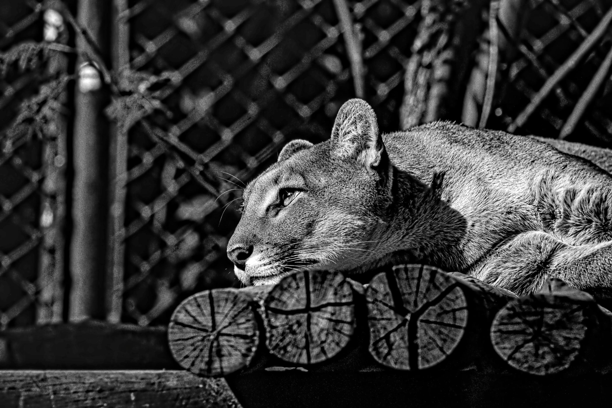
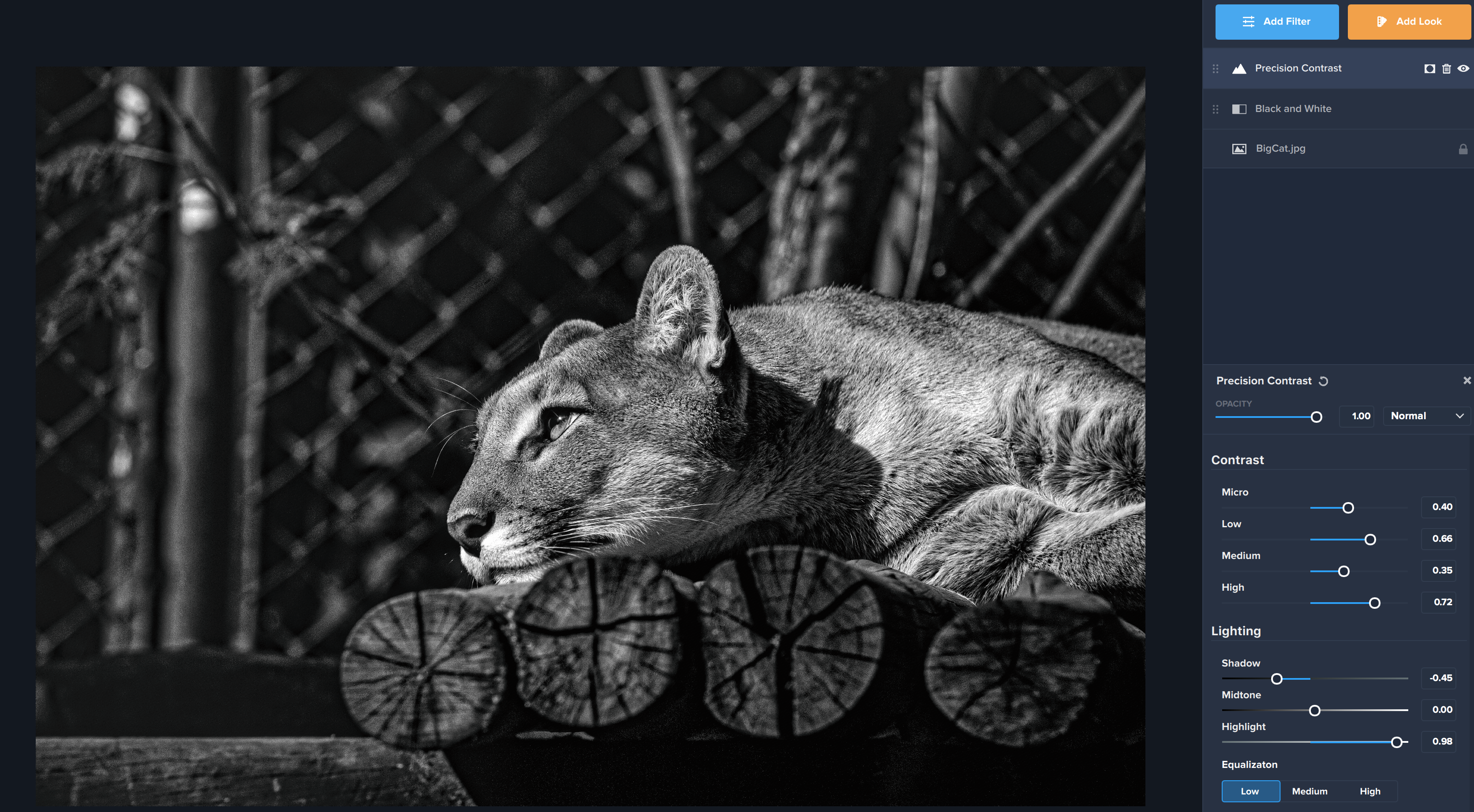
In just a few simple steps, we were able to take our faded image of this big cat and transform it into a high contrast, dramatic black and white image. We love that we can see the detail in the cat’s fur, the sharpness of it’s whiskers, and the moody gaze as it rests. Try out this process on one of your images and tell us how it went! We can’t wait to see what you create.

Posted on 1 Comment

Tutorial: How to Selectively Saturate and Desaturate in Topaz Studio 2

In a matter of just a few seconds you can easily make one (or a few) of the colors in a photo pop. Perhaps you have photographed a fire engine and only want to see it’s vibrant red in your image. Or perhaps your loved one has stunning green eyes that you want to see standing out in your image. Today we’ll show you two simple ways to selectively adjust the saturation of a specific color in your image in Topaz Studio 2 using HSL Color Tuning.

HSL Color Tuning

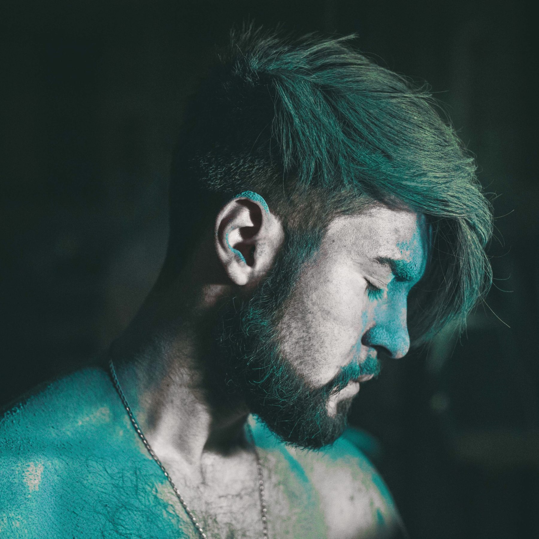
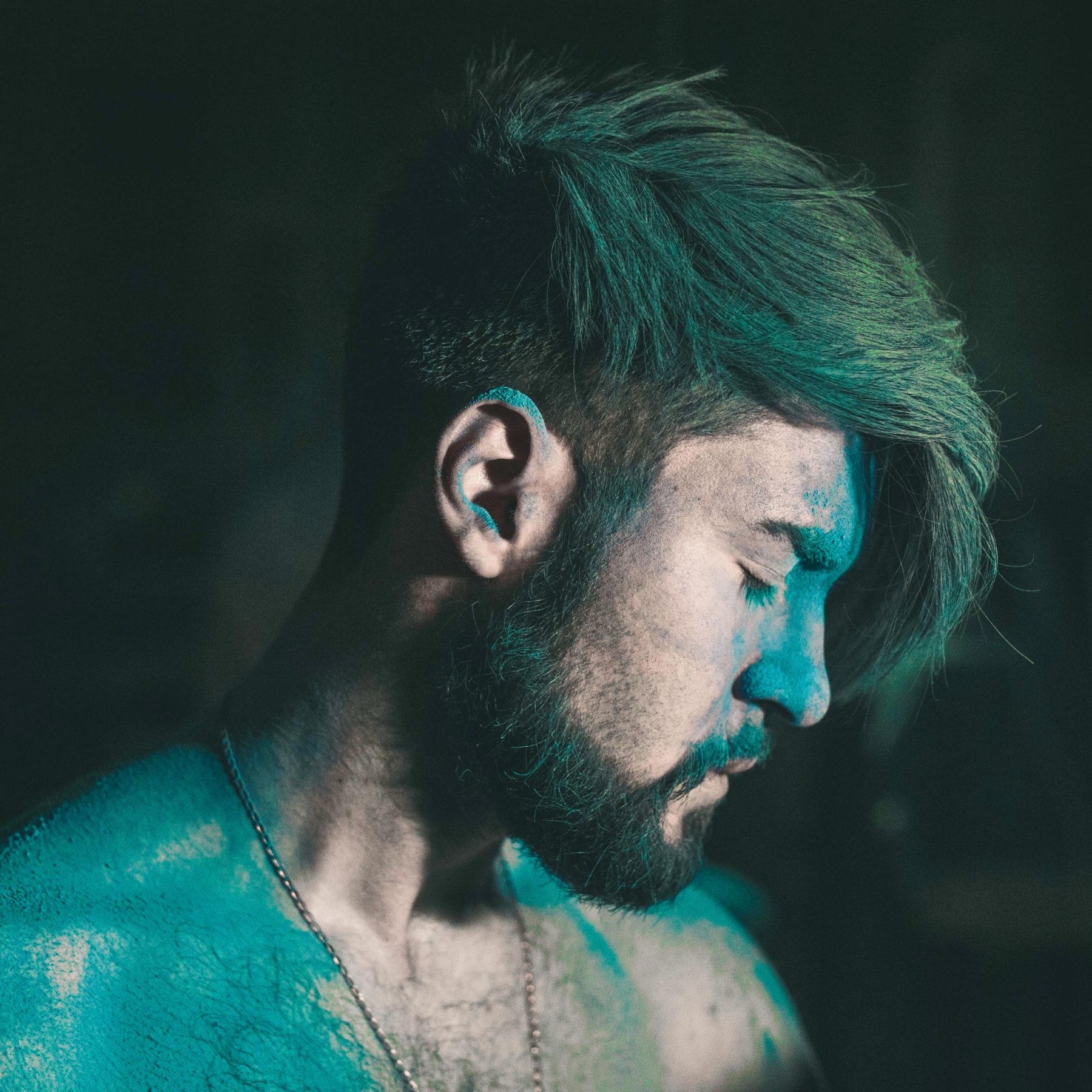
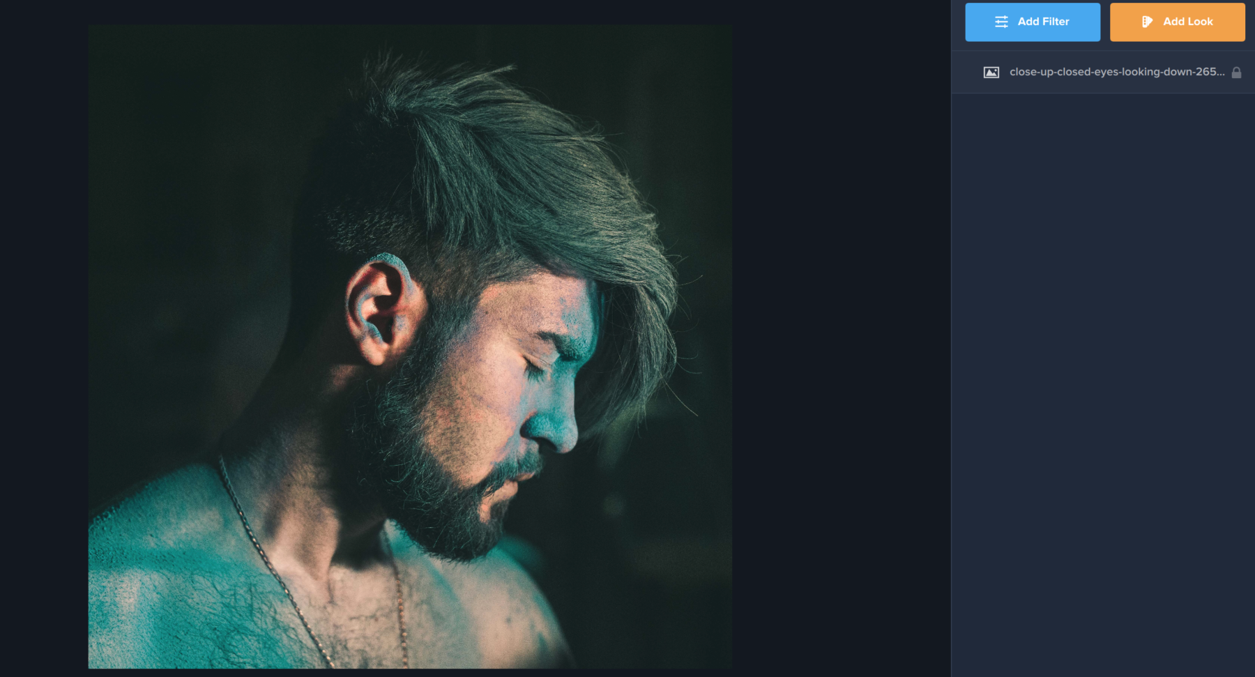
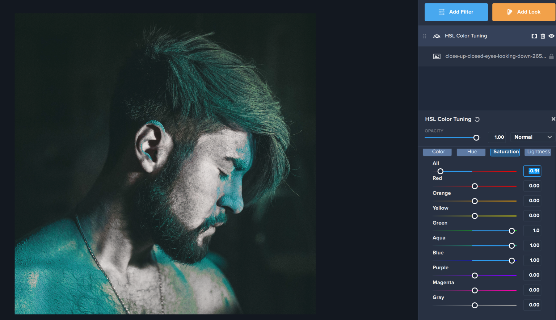
We’ll start off by opening our image in Topaz Studio. Our goal is to make the teal powder on this man’s skin stand out from the rest of the photo. To do this, we’ll want to desaturate the rest of the photo so that the color stands out.

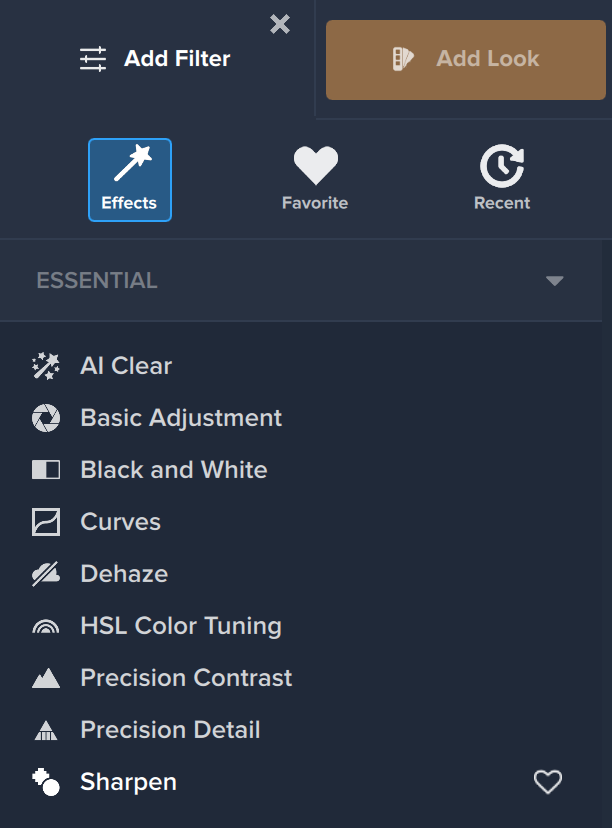
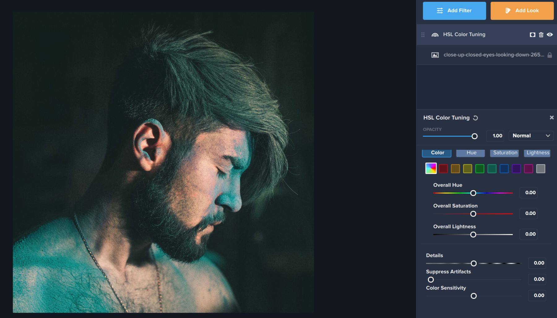
The first thing you’ll want to do is click the blue Add Filter button in the right-hand menu. This is where you’ll find over 30 unique and customizable filters to use on your image. You’ll find HSL Color Tuning under the first Category – Essential. HSL Color tuning deals directly with the colors in your image, so it’s the perfect filter to use when wanting to change, adjust, or desaturate specific colors in your image.

Method 1: Overall Desaturation

Once you apply HSL Color Tuning, the first thing you’ll want to do is click Saturation Tab near the top of the Filter (between Hue and Lightness). This will help us deal with the saturation of colors in the photo directly. 

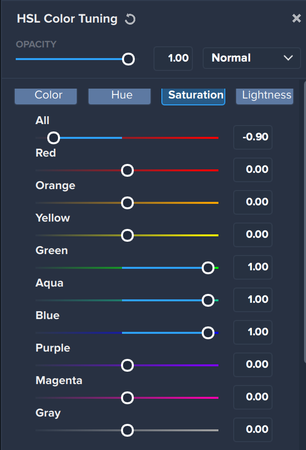
The first method we’re going to apply is overall desaturation. This is where you remove all the colors from your image before adding back in the color you’d like to see. To do this, we first adjust the “All” slider at the top of the image. You’ll notice that we didn’t move the “All” slider all the way down to -1.00. This is because doing so would make it much more difficult to bring back the teal that exists in the photo. Then, since teal is made up of a combination of Green, Aqua, and Blue, we moved those sliders up as high as they would go so that you could once again see the powder in the image.

You’ll notice that the colors in this image are a bit muted but still stand out in the photo. We also haven’t completely desaturated the entire image since we kept the “All” slider at .91. This creates a slightly more subtle look in the colors of your overall image.

Method 2: Selective Color Desaturation

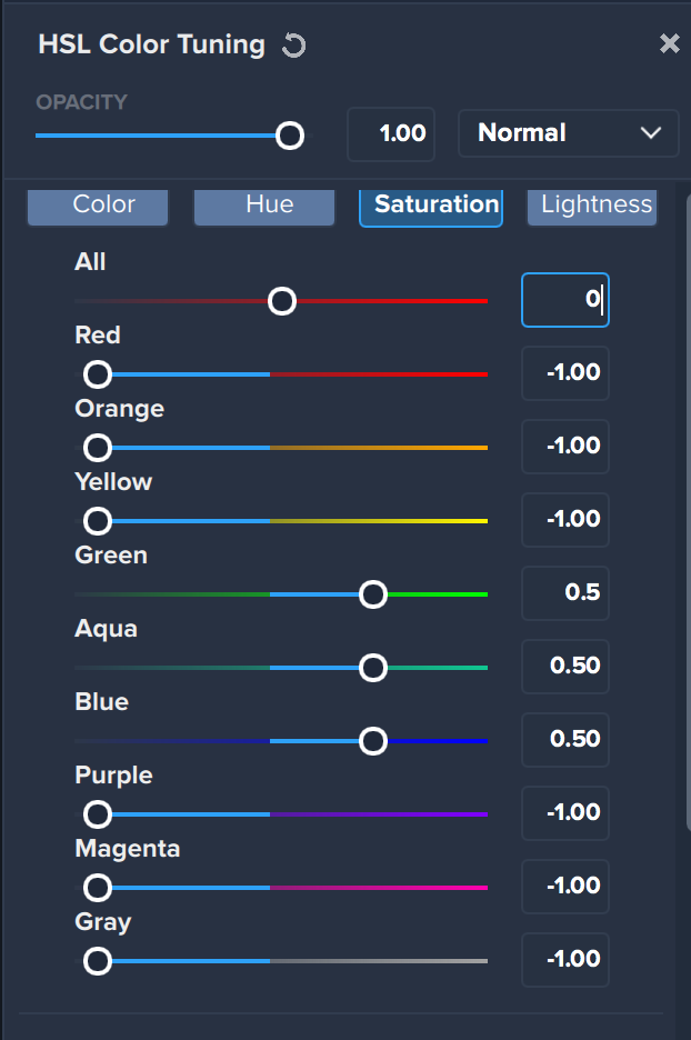
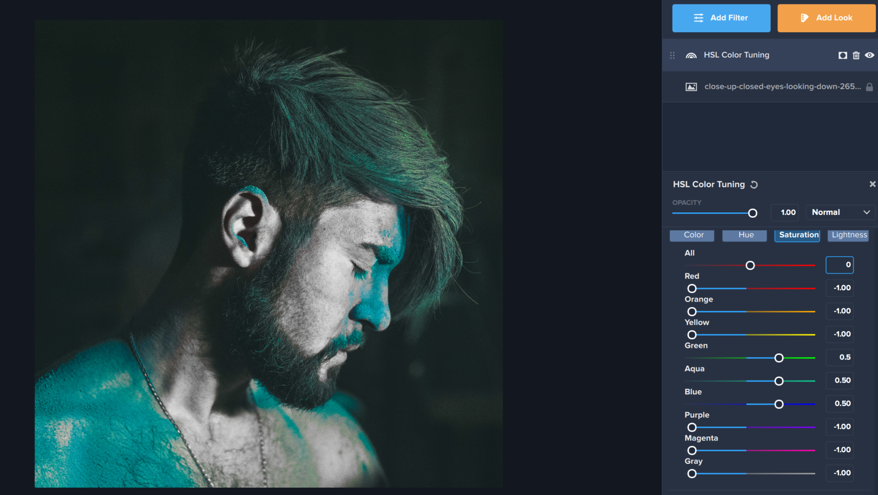
The second method you can use is to selectively desaturate the colors in your photo you are not interested in. This will completely remove all saturation from the image, except for the colors you’d like to keep. This method could be helpful if you want both a green and a red to stand out in a Christmas photo or if you wanted to see multiple colors in a multi-colored flower while desaturating the rest of the image. To do this, we are just going to lower the saturation for all the colors except for the ones we want to keep in the image. Then, to make our teal stand out even more, we’re going to adjust the Green, Aqua, and Blue sliders about halfway. When moving the sliders all the way up, the blues became a lot more vibrant in the image than we liked, which is why we only moved them halfway. You can play with these sliders to see just how vibrantly you want to see these colors in the image. 

The Final Result!

HSL Color tuning is a powerful way to adjust the saturation in your images, whether it’s blue powder, a yellow sundress, or green eyes. Let us know in the comments how you like to use selective desaturation in Topaz Studio 2!