Today we are going over a few adjustments in Topaz Studio, to show you the creativity and control you can have over your images.
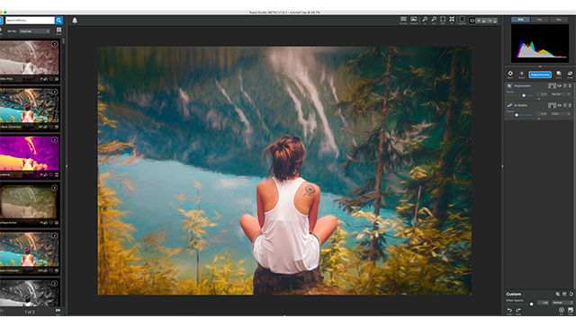
Today we start with this image of a girl sitting on a stump overlooking a river. What we are going to do is make the background seem more painterly, while keeping her realistic. This way it looks as if she was dropped into a painting.
We will be using one helping of Impression, one spoonful of Ai Remix, and one healthy scoop of HSL Color Tuning. We will also be using masks, blending modes, and opacity setting to help control the effects of each adjustment and how it is applied to our photo.
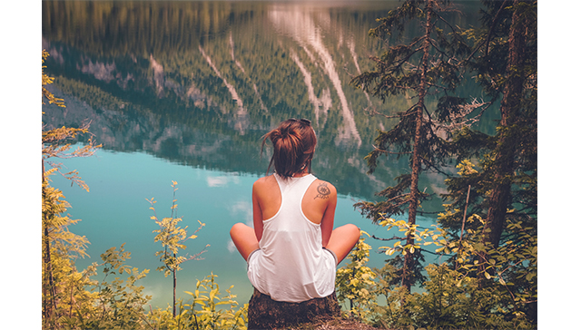
(before)
(after)
Wanna See how it’s done? Watch the video below!
With that being said, lets jump feet first into these edits.
1. Impression
First we’re going to start with Impression. Go to the adjustments drop down menu and select impression. The VERY FIRST thing I want to do is mask out my girl, this way any effects we put on the photo does not affect her in any way.
So, go to the mask icon, which is the white box in-between the adjustments name and the eye icon, and click it. This will open the mask menu. We’re going to select a slightly smaller brush, keep the masking area white, and the mask its self black. Select the black square, to be sure we have the black MASK OUT brush selected, and color in the girl and her hair. When this is completed select done at the bottom.
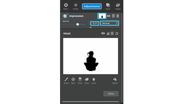 Now we’ll get into the adjustment settings.
Select the first brush to apply to this image. I want this to look a bit like an acrylic painting and a little messy.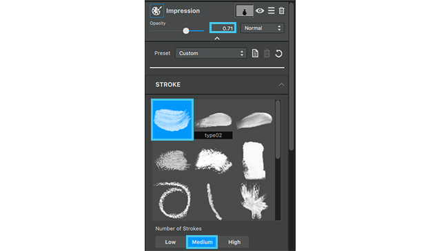
- Number of strokes: Medium
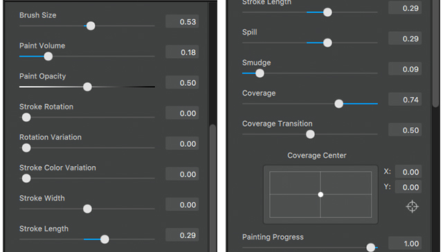
- Brush Size: .53
- Paint Volume: .18
- Paint Opacity: .50
- Stroke length: .29
- Spill: .29
- Smudge: .09
- Coverage: .74
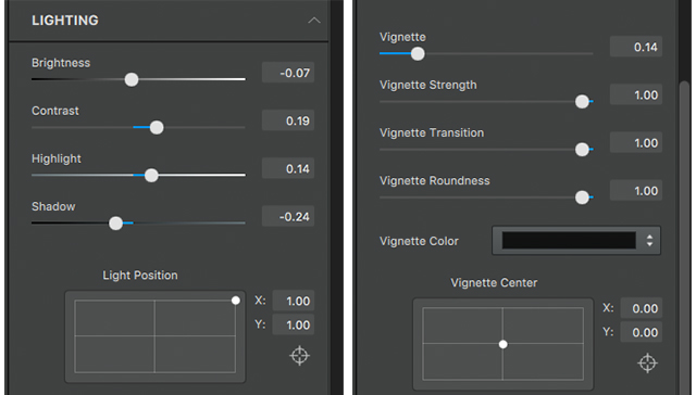
Next we will go into the lighting drop down at the bottom of this adjustment menu just to give the image a more vibrant feeling, like you often get with acrylic paint.
Lighting drop down:
- Brightness: .-07
- Contrast: .19
- Highlight: .14
- Shadow: -.24
- Vignette: .14
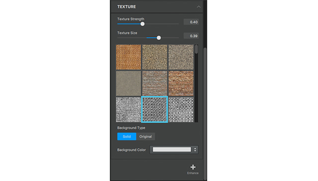
We are also going to add a little bit of texture to give this image a canvas feeling to play more of the idea of making this more and more like an acrylic painting in the background.
- The Texture we are going to select is in the 3rd row 2nd column.
- Texture Strength: .40
- Texture Size: .39
Woo!
Now that we are through all of that bring the opacity to .71, and lets move on to the next adjustment.

As you can see this brings an impressionistic feel to the background.
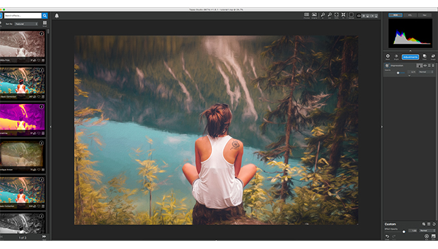 The colors still seem a little muted to me so we’re going to add an Ai ReMix adjustment to add a little bit a texture and bring some life to this color!
2. Ai ReMix
Go to adjustments menu, select AI Remix.
First thing we are going to do with this adjustment is copy the mask from the previous adjustment.
Click the mask icon on the previous adjustment, and select the hamburger menu (in-between the invert icon and the reset icon). Click this menu and select copy mask.
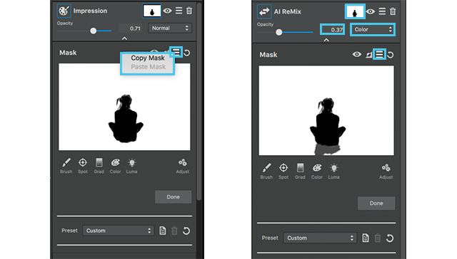
Close that adjustment but using the arrow at the top, and select the mask on the AI Remix. Go to the same hamburger menu on this adjustment and select past mask. This time we are going to add a little bit to this mask. Select a grey brush and brush in the tree stump, that way the Adjustment doesn’t fully affect this area.
After completing this close the masking menu, by clicking done, now we can go into the actual setting of this adjustment.
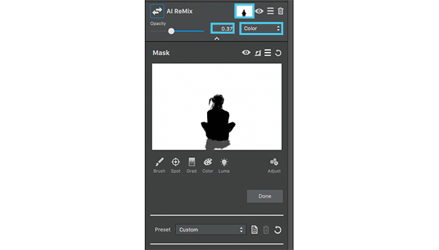
- The style we are going to choose is in the 5th row 2nd column, it looks like a pasture, click and apply. We aren’t going to do too much to the setting, so close the drop down menu and go into the opacity.
- We are going to set our opacity to .37 and the blending mode to color.
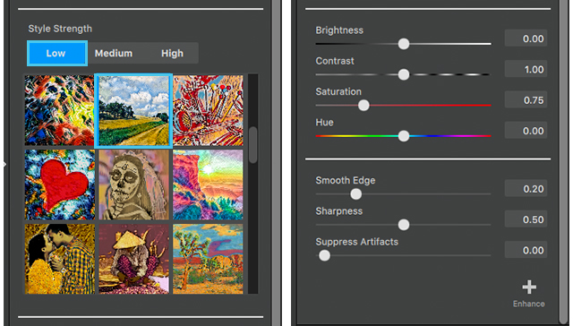
This allows Ai ReMix to adapt better to the colors of the image and the previous adjustments.
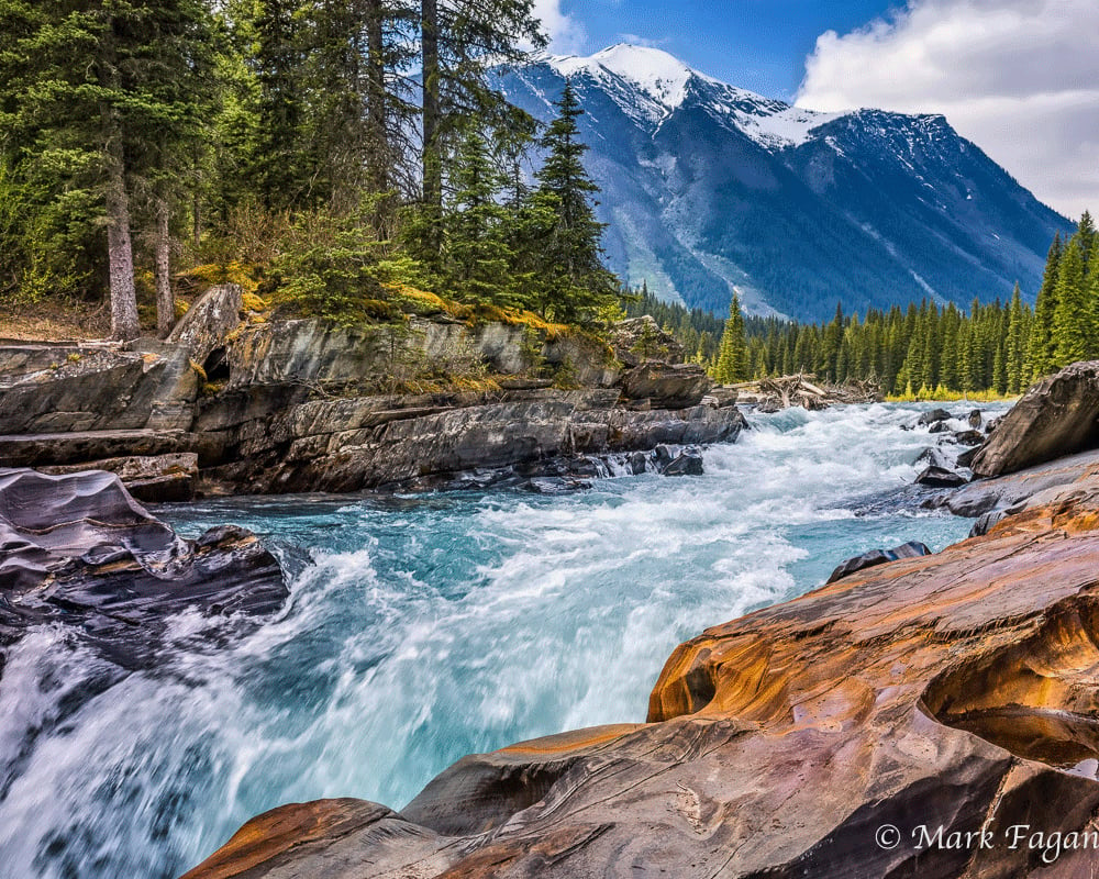
With the addition of the Ai ReMix the look of a textured background is a lot more evident in addition, the color of the water is more vibrant, the yellow of the trees pops (but isn’t distracting), and we even added a bit more green to the mountains across from her. I would still like to play with a few of the colors in the background, to make the seem more painterly, so we’re going to apply an HSL Color Tuning adjustment.
3. HSL Color Tuning
The Final Adjustment is an HSL Color tuning.
We are going to apply the mask from the first adjustment one more time, but since we already have it copied all we have to do is going into the mask menu on this layer, go to the hamburger menu and select past mask.
Now we get to play with the settings of the adjustment.
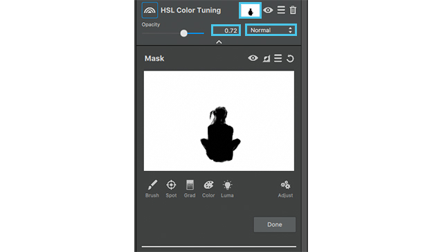
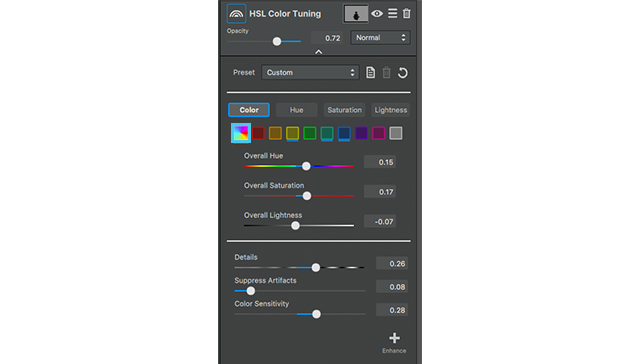
The colors we’re going to edit the overall color, yellow, aqua, and blue.
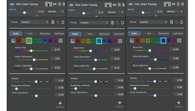
- Yellow Settings:
Yellow Saturation: .21 - Aqua Settings:
Aqua Saturation: .35
Aqua Lightness: .24 - Blue Settings:
Blue Saturation: .39 - Overall Settings:
Overall Hue: .15
Overall Saturation: .17
Overall Lightness: -.07
No we are going to go into the detail settings
- Details: .26
- Suppress artifacts: .08
- Color Sensitivity: .28
- Finally go to the opacity and bring it down to .72.
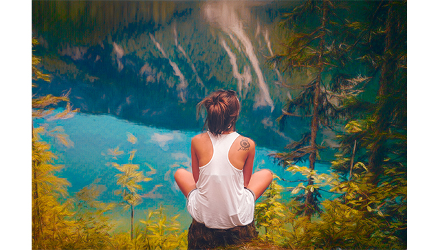
As you can see all these setting make the background mimic an almost impressionistic acrylic painting.
Additional tip:
Since we haven’t had a tutorial on digital frame either I thought I would take the time to add an extra tidbit to this top tip.
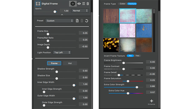
Now I’m going to do a pretty simplistic frame with the default setting because I like the way it fits the photo, but what I am going to go in an edit is the texture around the frame.
We are going to select 2nd texture out of the 1st row, this is actually one of my favorite textures in studio as a whole so I tend to lean toward it often.
After selecting this texture we are going to go down to the color setting, because I want the colors of the frame to play more off the blue of the water; and instead of picking a frame that mimics the color we’re going to edit the color of this frame to our liking.
So go to the frame color setting menu at the bottom and set them to the following:
- Frame brightness: -.22
- Frame contrast: .27
- Frame Detail: -.26
- Frame Saturation: .25
- Extra color strength: .88
- Extra Color Hue: .57
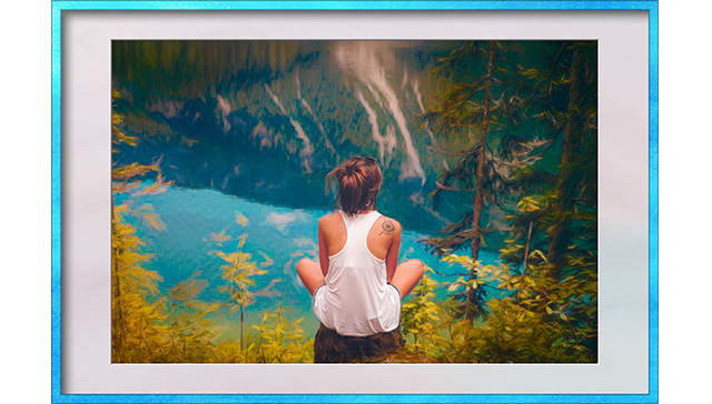
As you can see this just adds an extra touch to our image to give it more of a professional presentation
Well thats it for this Topaz Studio tutorial! Join us next time to see what you can learn.



1 thought on “Creating Imagery Driven by Imagination with Topaz Studio”
very beautiful !
i didn’t know we can change the color of a textured frame. a eyedropper would be nice add-in.
i like the “hamburger” name for this kind of menu 🙂
marc
Comments are closed.