Posted on 1 Comment

Creating Imagery Driven by Imagination with Topaz Studio

Today we are going over a few adjustments in Topaz Studio, to show you the creativity and control you can have over your images.

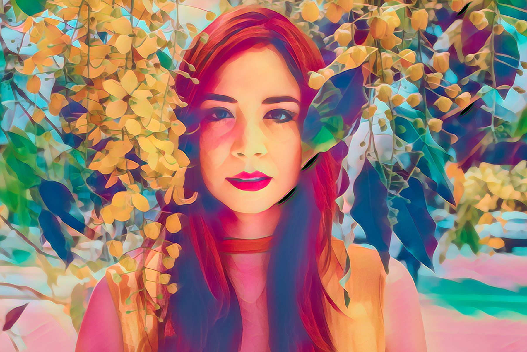
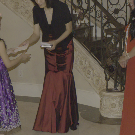
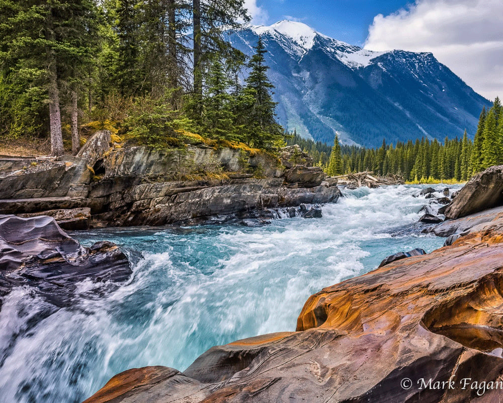
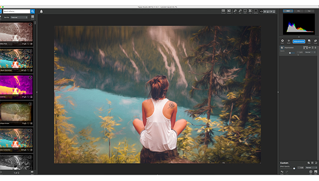
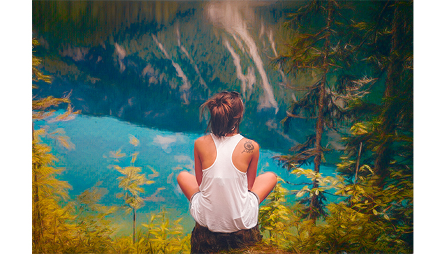
Today we start with this image of a girl sitting on a stump overlooking a river. What we are going to do is make the background seem more painterly, while keeping her realistic. This way it looks as if she was dropped into a painting.

We will be using one helping of Impression, one spoonful of Ai Remix, and one healthy scoop of HSL Color Tuning. We will also be using masks, blending modes, and opacity setting to help control the effects of each adjustment and how it is applied to our photo.
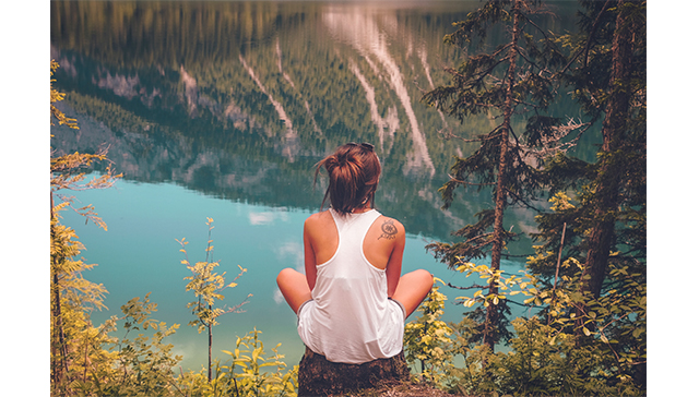
(before)
(after)


Wanna See how it’s done? Watch the video below!


With that being said, lets jump feet first into these edits.

1. Impression

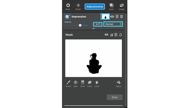
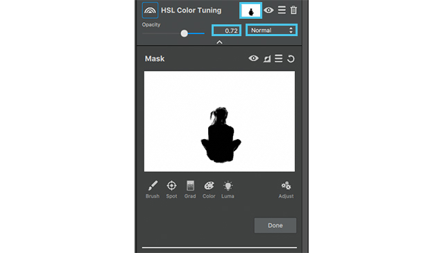
First we’re going to start with Impression. Go to  the adjustments drop down menu and select impression. The VERY FIRST thing I want to do is mask out my girl, this way any effects we put on the photo does not affect her in any way.

So, go to the mask icon, which is the white box in-between the adjustments name and the eye icon, and click it. This will open the mask menu. We’re going to select a slightly smaller brush, keep the masking area white, and the mask its self black. Select the black square, to be sure we have the black MASK OUT brush selected, and color in the girl and her hair. When this is completed select done at the bottom.

Now we’ll get into the adjustment settings.
Select the first brush to apply to this image. I want this to look a bit like an acrylic painting and a little messy.

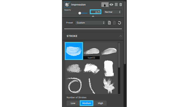
  1. Number of strokes: Medium
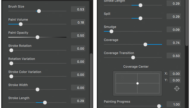
  2. Brush Size: .53
  3. Paint Volume: .18
  4. Paint Opacity: .50
  5. Stroke length: .29
  6. Spill: .29
  7. Smudge: .09
  8. Coverage: .74

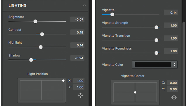
Next we will go into the lighting drop down at the bottom of this adjustment menu just to give the image a more vibrant feeling, like you often get with acrylic paint.

Lighting drop down:

  1. Brightness: .-07
  2. Contrast: .19
  3. Highlight: .14
  4. Shadow: -.24
  5. Vignette: .14

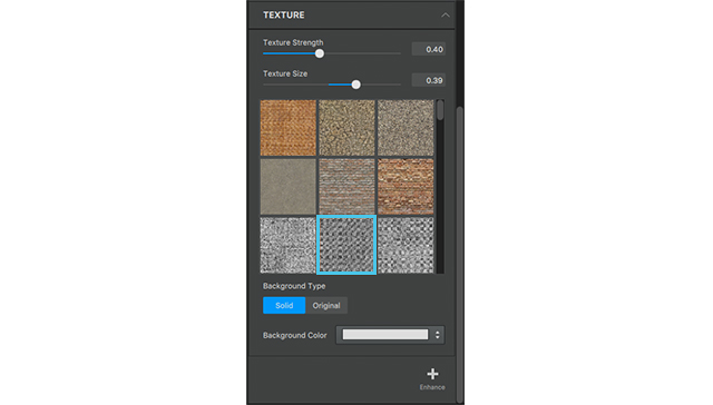
We are also going to add a little bit of texture to give this image a canvas feeling to play more of the idea of making this more and more like an acrylic painting in the background.

  1. The Texture we are going to select is in the 3rd row 2nd column.
  2. Texture Strength: .40
  3. Texture Size: .39

Woo!

Now that we are through all of that bring the opacity to .71, and lets move on to the next adjustment.

As you can see this brings an impressionistic feel to the background.

The colors still seem a little muted to me so we’re going to add an Ai ReMix adjustment to add a little bit a texture and bring some life to this color!

2. Ai ReMix

Go to adjustments menu, select AI Remix.
First thing we are going to do with this adjustment is copy the mask from the previous adjustment.

Click the mask icon on the previous adjustment, and select the hamburger menu (in-between the invert icon and the reset icon). Click this menu and select copy mask.

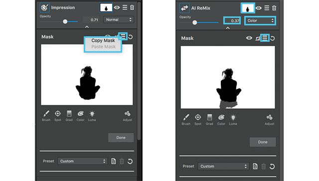
Close that adjustment but using the arrow at the top, and select the mask on the AI Remix. Go to the same hamburger menu on this adjustment and select past mask. This time we are going to add a little bit to this mask. Select a grey brush and brush in the tree stump, that way the Adjustment doesn’t fully affect this area.

After completing this close the masking menu, by clicking done, now we can go into the actual setting of this adjustment.

  1. The style we are going to choose is in the 5th row 2nd column, it looks like a pasture, click and apply. We aren’t going to do too much to the setting, so close the drop down menu and go into the opacity.
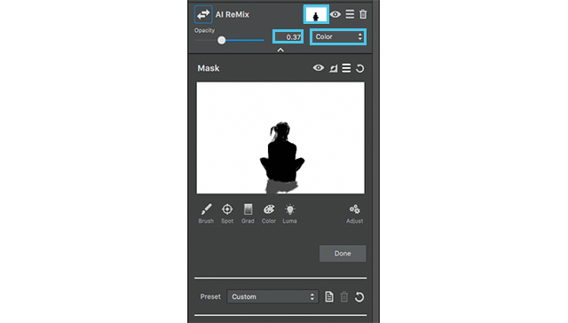
  2. We are going to set our opacity to .37 and the blending mode to color.

This allows Ai ReMix to adapt better to the colors of the image and the previous adjustments.

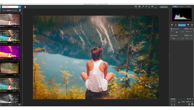
With the addition of the Ai ReMix the look of a textured background is a lot more evident in addition, the color of the water is more vibrant, the yellow of the trees pops (but isn’t distracting), and we even added a bit more green to the mountains across from her. I would still like to play with a few of the colors in the background, to make the seem more painterly, so we’re going to apply an HSL Color Tuning adjustment.
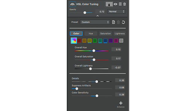
3. HSL Color Tuning

The Final Adjustment is an HSL Color tuning.

We are going to apply the mask from the first adjustment one more time, but since we already have it copied all we have to do is going into the mask menu on this layer, go to the hamburger menu and select past mask.
Now we get to play with the settings of the adjustment.

The colors we’re going to edit the overall color, yellow, aqua, and blue.
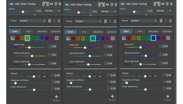
  1. Yellow Settings:
    Yellow Saturation: .21
  2. Aqua Settings:
    Aqua Saturation: .35
    Aqua Lightness: .24
  3. Blue Settings:
    Blue Saturation: .39
  4. Overall Settings:
    Overall Hue: .15
    Overall Saturation: .17
    Overall Lightness: -.07

No we are going to go into  the detail settings

  1. Details: .26
  2. Suppress artifacts: .08
  3. Color Sensitivity: .28
  4. Finally go to the opacity and bring it down to .72.

As you can see all these setting make the background mimic an almost impressionistic acrylic painting.

Additional tip:

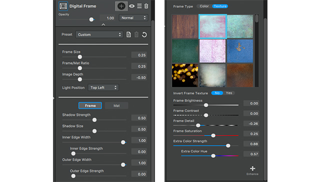
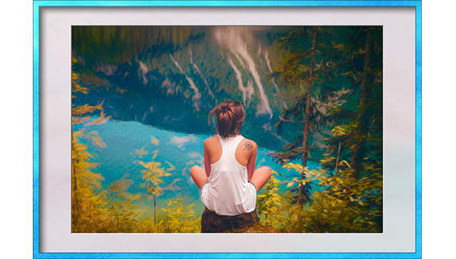
Since we haven’t had a tutorial on digital frame either I thought I would take the time to add an extra tidbit to this top tip.

Now I’m going to do a pretty simplistic frame with the default setting because I like the way it fits the photo, but what I am going to go in an edit is the texture around the frame.
We are going to select 2nd texture out of the 1st row, this is actually one of my favorite textures in studio as a whole so I tend to lean toward it often.

After selecting this texture we are going to go down to the color setting, because I want the colors of the frame to play more off the blue of the water; and instead of picking a frame that mimics the color we’re going to edit the color of this frame to our liking.

So go to the frame color setting menu at the bottom and set them to the following:

  1. Frame brightness: -.22
  2. Frame contrast: .27
  3. Frame Detail: -.26
  4. Frame Saturation: .25
  5. Extra color strength: .88
  6. Extra Color Hue: .57

As you can see this just adds an extra touch to our image to give it more of a professional presentation

Well thats it for this Topaz Studio tutorial! Join us next time to see what you can learn.

Posted on 7 Comments

Rose Double Exposure with Topaz Studio

[vc_row][vc_column][vc_column_text]We are excited to share with our users, our brand new Topaz Product, Topaz Studio. Hazel Meredith with Meredith Images is back with us for this tutorial teaching some basic features in Topaz Studio such as choosing and tweaking effects, as well as using the Texture Adjustment to create double exposures.


[/vc_column_text][vc_empty_space height=”15px”][qodef_blockquote text=”This tutorial demonstrates just a small amount of the vast capabilities of the new Topaz Studio. It’s awesome to be able to use all of the Topaz products in one handy Studio!” title_tag=”h3″][vc_empty_space height=”15px”][vc_separator border_width=”3″][vc_empty_space height=”15px”][vc_column_text]

Not Familiar with Topaz Studio?

Topaz Studio is a fast, flexible, powerful creative toolbox and it’s the next level image editor for photographers. Topaz Studio gives you lightning fast results with Topaz’s exclusive image processing technology, in an intuitive, affordable, easy to use application. You can learn more about Topaz Studio in the Announcement and Overview article.

“This is all your Topaz products wrapped into one program.”

We’re Giving Topaz Studio Away! Yep, you read that right. You’ll get complete freedom to use Topaz Studio’s comprehensive masking, as well as 10 free adjustments, opacity slider, blending modes plus full functionality to use it as plugin, a host editor for all Topaz Labs existing products, and standalone all for free. If you’d like to learn more about all the free functionality within Topaz Studio, checkout our What’s Free? article.


[/vc_column_text][/vc_column][/vc_row][vc_row][vc_column][vc_column_text]

Free Download

[/vc_column_text][vc_empty_space height=”15px”][vc_row_inner][vc_column_inner width=”1/2″][vc_btn title=”Windows” shape=”square” color=”primary” align=”center” button_block=”true” link=”url:https%3A%2F%2Fopen_beta.s3.amazonaws.com%2Ftopazstudio_online_installer.exe|||”][/vc_column_inner][vc_column_inner width=”1/2″][vc_btn title=”Mac” shape=”square” color=”primary” align=”center” button_block=”true” link=”url:https%3A%2F%2Fopen_beta.s3.amazonaws.com%2Ftopazstudio_online_installer.dmg|||”][/vc_column_inner][/vc_row_inner][vc_empty_space height=”15px”][vc_separator border_width=”3″][/vc_column][/vc_row][vc_row][vc_column][vc_empty_space][vc_column_text]

Step 1: Open your Image

[/vc_column_text][vc_empty_space height=”15px”][vc_column_text]

I opened the Topaz Studio directly from my desktop as a “stand alone”. You have the option of working that way, or to open the Studio directly from Photoshop or Lightroom.

If you open Topaz Studio as a standalone, you can add images by simply dragging and dropping or by choosing File > Open Image…

If you chose to use Topaz Studio as a plugin, it can be found by choosing

Filter > Topaz Labs > Topaz Studio  in Photoshop.

[/vc_column_text][/vc_column][/vc_row][vc_row][vc_column][vc_empty_space][vc_column_text]

Step 2: Search for an Effect

[/vc_column_text][vc_empty_space height=”15px”][vc_column_text]

Topaz Studio has an awesome feature called the Topaz Community. It allows you to share effects with other Topaz Studio users. I have saved an Effect called Rose Double Exposure that works great for Raw files. To apply the Rose Double Exposure preset, simply search for it in the Effect Panel. 

[/vc_column_text][vc_empty_space height=”15px”][vc_single_image image=”8786″ img_size=”full” alignment=”center”][vc_empty_space][/vc_column][/vc_row][vc_row][vc_column][vc_column_text]

Step 3: Editing Your Image

[/vc_column_text][vc_empty_space height=”15px”][vc_column_text]When you initially apply the Double Exposure preset, you will notice there are no changes made to your image. All Adjustments are set to default values. This allows you to go through each Adjustment and make the necessary tweaks tailored specifically to your image. This effect is a great starting point to know which Adjustments to use in a complete workflow from start to finish.

I went down the preset making changes to the Basic Adjustment, and then tweaks to the Reduce Noise, Precision Contrast, Tone Curves, HSL Color Tuning, and Vignette Adjustments. I did not make any changes to DeHaze or Dual Tone.

Once I was satisfied, I chose to Apply the effect.

You may wish to Save As to keep the image saved with just this preset for future use.

[/vc_column_text][vc_empty_space height=”15px”][vc_row_inner][vc_column_inner width=”1/2″][vc_single_image image=”8789″ img_size=”full”][vc_column_text]

Before

[/vc_column_text][/vc_column_inner][vc_column_inner width=”1/2″][vc_single_image image=”8790″ img_size=”full”][vc_column_text]

After

[/vc_column_text][/vc_column_inner][/vc_row_inner][vc_empty_space][/vc_column][/vc_row][vc_row][vc_column][vc_column_text]

Step 3: Apply the Expressionalism Effect

[/vc_column_text][vc_empty_space height=”15px”][vc_column_text]

Next, I re-opened the Effects panel to see what else I wanted to do.

I went to the Fine Art category of Effects Panel. To browse through the various Effect categories, click the more button at the bottom of the Effects Toolbar. I liked the “Expressionalism” preset. As soon as you apply an effect, you will see the Adjustments populate in the Adjustment Panel on the right-hand side of the screen. 

[/vc_column_text][vc_empty_space height=”15px”][vc_single_image image=”8795″ img_size=”large” alignment=”center”][vc_empty_space][/vc_column][/vc_row][vc_row][vc_column][vc_column_text]

Step 4: Customize the Expressionalism Effect

[/vc_column_text][vc_empty_space height=”15px”][vc_row_inner][vc_column_inner width=”2/3″][vc_single_image image=”8875″ img_size=”large” alignment=”center”][/vc_column_inner][vc_column_inner width=”1/3″][vc_empty_space height=”15px”][vc_empty_space height=”15px”][vc_column_text]

From here I opened the Basic Adjustment section and lowered the Highlight slider to -.38 just to tone down the brighter areas of the rose. I also lowered the Saturation to -.21. I did not make any further changes to this preset. Again, you may want to save a copy of your image for future use.

[/vc_column_text][/vc_column_inner][/vc_row_inner][vc_empty_space][/vc_column][/vc_row][vc_row][vc_column][vc_column_text]

Step 5: Add a Texture

[/vc_column_text][vc_row_inner][vc_column_inner width=”2/3″][vc_empty_space height=”15px”][vc_empty_space height=”15px”][vc_single_image image=”8799″ img_size=”large” alignment=”center”][/vc_column_inner][vc_column_inner width=”1/3″][vc_column_text]

Next, I added a Texture Adjustment to my image by clicking More icon at the bottom of your Adjustment toolbar (bottom right). You will see an asset library that shows all of the textures, backgrounds, borders, light leaks, dust & scratches layers, etc. You can choose the Group you want by clicking the drop down next to Group.

I chose the brick wall texture to give my rose the illusion of being painted on the wall! After making a few adjustments to the sliders, I clicked on the “+ Enhance” in the lower right of the palette, and chose Black & White. This made the brick texture B&W to reduce the effect on the colors of the rose.


[/vc_column_text][/vc_column_inner][/vc_row_inner][vc_empty_space][/vc_column][/vc_row][vc_row][vc_column][vc_column_text]

Gallery

[/vc_column_text][vc_empty_space height=”15px”][vc_column_text]Here are some more edits that were made using the same process in Topaz Studio. Thanks for reading and I hope you enjoyed it![/vc_column_text][vc_empty_space height=”15px”][vc_row_inner][vc_column_inner width=”1/2″][vc_single_image image=”8809″ img_size=”large” alignment=”center”][vc_column_text]

Before

[/vc_column_text][vc_empty_space height=”15px”][vc_single_image image=”8810″ img_size=”large” alignment=”center”][vc_column_text]

Before

[/vc_column_text][/vc_column_inner][vc_column_inner width=”1/2″][vc_single_image image=”8811″ img_size=”large” alignment=”center”][vc_column_text]

After

[/vc_column_text][vc_empty_space height=”15px”][vc_single_image image=”8812″ img_size=”large” alignment=”center”][vc_column_text]

After

[/vc_column_text][/vc_column_inner][/vc_row_inner][vc_empty_space][/vc_column][/vc_row][vc_row][vc_column][vc_column_text]

Step 6: Save Your Work

[/vc_column_text][vc_empty_space height=”15px”][vc_column_text]When you are satisfied with your edits, Save your image by Clicking File > Save As…

Here’s the finished image:[/vc_column_text][vc_empty_space height=”15px”][vc_single_image image=”8808″ img_size=”large” alignment=”center”][vc_empty_space][/vc_column][/vc_row][vc_row][vc_column][vc_column_text]

That’s All For Today

[/vc_column_text][vc_column_text]Thanks for reading! That’s just one of the many things you can effortlessly accomplish in Topaz Studio. Topaz Studio is great for gaining inspiration from pre-made effects or allowing you to create your own looks with our immense library of editing tools.

We’ll be adding more tutorials and videos so be sure to give us a follow to learn more!

If you’d like to share your images with us, tag us on Instagram with @topazlabs and Twitter with @topazlabs. We’re also on Facebook and YouTube![/vc_column_text][vc_empty_space][/vc_column][/vc_row][vc_row][vc_column][vc_column_text]

Free Download

[/vc_column_text][vc_empty_space height=”15px”][vc_row_inner][vc_column_inner width=”1/2″][vc_btn title=”Windows” shape=”square” color=”primary” align=”center” button_block=”true” link=”url:https%3A%2F%2Fopen_beta.s3.amazonaws.com%2Ftopazstudio_online_installer.exe|||”][/vc_column_inner][vc_column_inner width=”1/2″][vc_btn title=”Mac” shape=”square” color=”primary” align=”center” button_block=”true” link=”url:https%3A%2F%2Fopen_beta.s3.amazonaws.com%2Ftopazstudio_online_installer.dmg|||”][/vc_column_inner][/vc_row_inner][/vc_column][/vc_row][vc_row][vc_column][vc_empty_space height=”15px”][vc_separator border_width=”3″][vc_empty_space height=”15px”][vc_column_text]

About Hazel Meredith

[/vc_column_text][vc_empty_space height=”15px”][vc_row_inner][vc_column_inner width=”1/4″][vc_single_image image=”8815″ img_size=”150×150″ alignment=”center” style=”vc_box_circle_2″][/vc_column_inner][vc_column_inner width=”3/4″][vc_column_text]

Hazel is involved with the photographic community on local, regional and national levels. She is currently secretary of the Connecticut Association of Photographers; and a Vice President on the board of the New England Camera Club Council. She is active in the Greater Bridgeport Camera Club where she has held several officer positions, and is also active in the Photographic Society of America (PSA). In 2008 she received an honors distinction of Master Member of the New England Camera Club Council (MNEC) during its annual conference, and in September, 2013, she was awarded the distinction of APSA from the Photographic Society of America at their annual conference. Hazel teaches at many New England camera clubs as well as photographic conferences and events throughout the U.S. She offers workshops and travel photo trips through her company, Meredith Images. She is a regular webinar presenter for Topaz Labs, and she released her first eBook,“Working with Textures & Overlays: Turn Ho-Hum into a Work of Art”in October 2015.

[/vc_column_text][/vc_column_inner][/vc_row_inner][vc_empty_space height=”15px”][vc_separator border_width=”3″][vc_empty_space height=”15px”][/vc_column][/vc_row]