Posted on 4 Comments

How to Use the Color Theme Adjustment

How to use the Color Theme Adjustment

[vc_row][vc_column][vc_column_text]Tutorial created with Topaz Studio V1.0.9[/vc_column_text][vc_column_text]Hello everyone! For today’s tutorial, I’ll be going over the Color Theme Adjustment in Topaz Studio. The Color Theme Adjustment transforms the mood of images by selectively boosting color saturation and harmonizing color palettes. I’m excited to show what this adjustment can do because it’s such a  fun one! I’m amazed at how easy you can completely recolor an image and it still appears very natural.[/vc_column_text][vc_column_text]

How to use the Color Theme Adjustment

How to use the Color Theme Adjustment

[/vc_column_text][vc_empty_space height=”15px”][vc_row_inner][vc_column_inner width=”1/4″][vc_empty_space height=”15px”][vc_single_image image=”60408″ img_size=”large” onclick=”link_image”][/vc_column_inner][vc_column_inner width=”3/4″][vc_column_text]Here’s a quick before and after of the header image in this tutorial just to show the capabilities of the Color Theme Adjustment. I chose an analogous color scheme for this image (I included the color swatches to the left if you’d like to mirror your own sunset image after this one)

Grab your own image and follow along![/vc_column_text][/vc_column_inner][/vc_row_inner][/vc_column][/vc_row][vc_row][vc_column][vc_row_inner][vc_column_inner][vc_empty_space][vc_separator][vc_empty_space height=”15px”][vc_column_text]

What You’ll Need

[/vc_column_text][vc_empty_space height=”15px”][vc_column_text]This beginner level walkthrough is really easy to follow along. You’ll only need a couple things to follow along with me:

1. Topaz Studio. You’ll need Topaz Studio on your computer if you’d like to follow along during this tutorial. It’s free to download. Color Theme is a Pro Adjustment, but you can start a 30 day free trial if you don’t own it.

2. An Image. Grab any image to follow along with or you can download the flower image here.

3. No more than 10 minutes. I kept it short and sweet. You’ll be done with this tutorial in under 10 minutes.[/vc_column_text][/vc_column_inner][/vc_row_inner][vc_empty_space height=”15px”][vc_separator][vc_empty_space height=”15px”][vc_column_text]Don’t have Topaz Studio? Topaz Studio is free to download! You can get it now by using the links below. If you need more information about Topaz Studio, check out this overview: Introducing Topaz Studio[/vc_column_text][vc_empty_space height=”15px”][vc_column_text]

Free Topaz Studio Download

[/vc_column_text][vc_empty_space height=”15px”][vc_row_inner][vc_column_inner width=”1/2″][vc_btn title=”Windows” shape=”square” color=”primary” align=”center” button_block=”true” link=”url:https%3A%2F%2Ftopazlabs.s3.amazonaws.com%2Ftopazstudio_online_installer.exe|||”][/vc_column_inner][vc_column_inner width=”1/2″][vc_btn title=”Mac” shape=”square” color=”primary” align=”center” button_block=”true” link=”url:https%3A%2F%2Ftopazlabs.s3.amazonaws.com%2Ftopazstudio_online_installer.dmg|||”][/vc_column_inner][/vc_row_inner][vc_separator][/vc_column][/vc_row][vc_row][vc_column][vc_row_inner disable_element=”yes”][vc_column_inner][vc_empty_space height=”15px”][vc_separator][vc_empty_space height=”15px”][vc_column_text]

Watch the Tutorial

[/vc_column_text][vc_column_text]Reading not your thing? You can watch the whole tutorial instead![/vc_column_text][vc_empty_space height=”15px”][vc_video link=”https://youtu.be/T9j3qvujcWY”][/vc_column_inner][/vc_row_inner][vc_row_inner][vc_column_inner][vc_empty_space][vc_column_text]

Overview of the Color Theme Adjustment

[/vc_column_text][vc_empty_space height=”15px”][vc_column_text]The Color Theme Adjustment allows you to harmonize your image’s color palette to create an overall stronger composition based upon Color Theory. If you aren’t familiar with Color Theory, it is the rules and guidelines followed by artists for color mixing or visual composition of specific color combinations. These rules are based upon the color wheel, which is comprised of three major categories: primary colors, secondary colors and tertiary colors. If you feel like you need a little bit more of an explanation on how Color Theory works, Adobe has a great visual tool that really helped explain mixing colors to me. (I’m a hands on learner and found it super beneficial). You can checkout their free online color mixing tool here.[/vc_column_text][vc_empty_space height=”15px”][vc_single_image image=”60227″ img_size=”medium” alignment=”center” onclick=”link_image”][/vc_column_inner][/vc_row_inner][vc_empty_space height=”15px”][vc_column_text]

Categories of Colors

[/vc_column_text][vc_empty_space height=”15px”][vc_separator][vc_row_inner][vc_column_inner width=”1/3″][vc_column_text]

Primary Colors

Red

Blue

Yellow

[/vc_column_text][/vc_column_inner][vc_column_inner width=”1/3″][vc_column_text]

Secondary Colors

Green

Violet

Orange

[/vc_column_text][/vc_column_inner][vc_column_inner width=”1/3″][vc_column_text]

Tertiary Colors

Yellow-Green

Blue-Green

Blue-Violet

Red-Violet

Red-Orange

Yellow- Orange

[/vc_column_text][/vc_column_inner][/vc_row_inner][vc_column_text]

Types of Color Schemes

[/vc_column_text][vc_empty_space height=”15px”][vc_separator][vc_empty_space height=”15px”][vc_row_inner][vc_column_inner width=”1/3″][vc_empty_space height=”15px”][vc_empty_space height=”15px”][vc_empty_space height=”15px”][vc_single_image image=”60255″ img_size=”large”][/vc_column_inner][vc_column_inner width=”2/3″][vc_column_text]

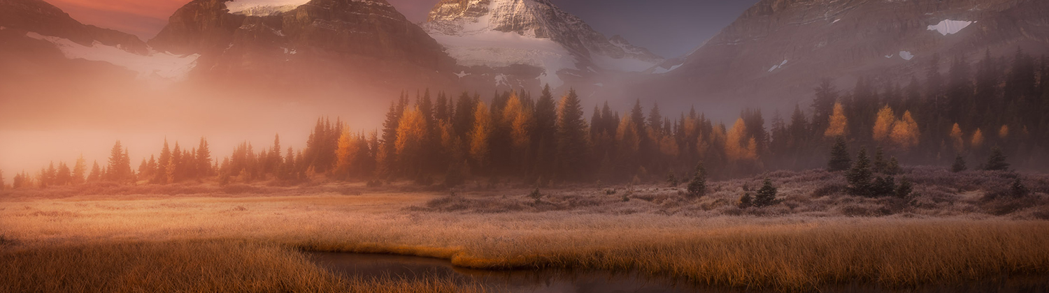
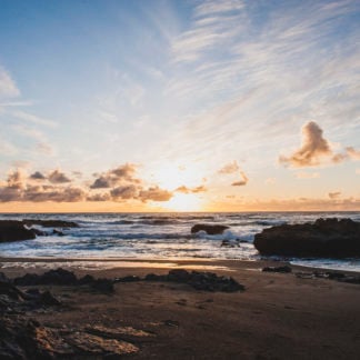
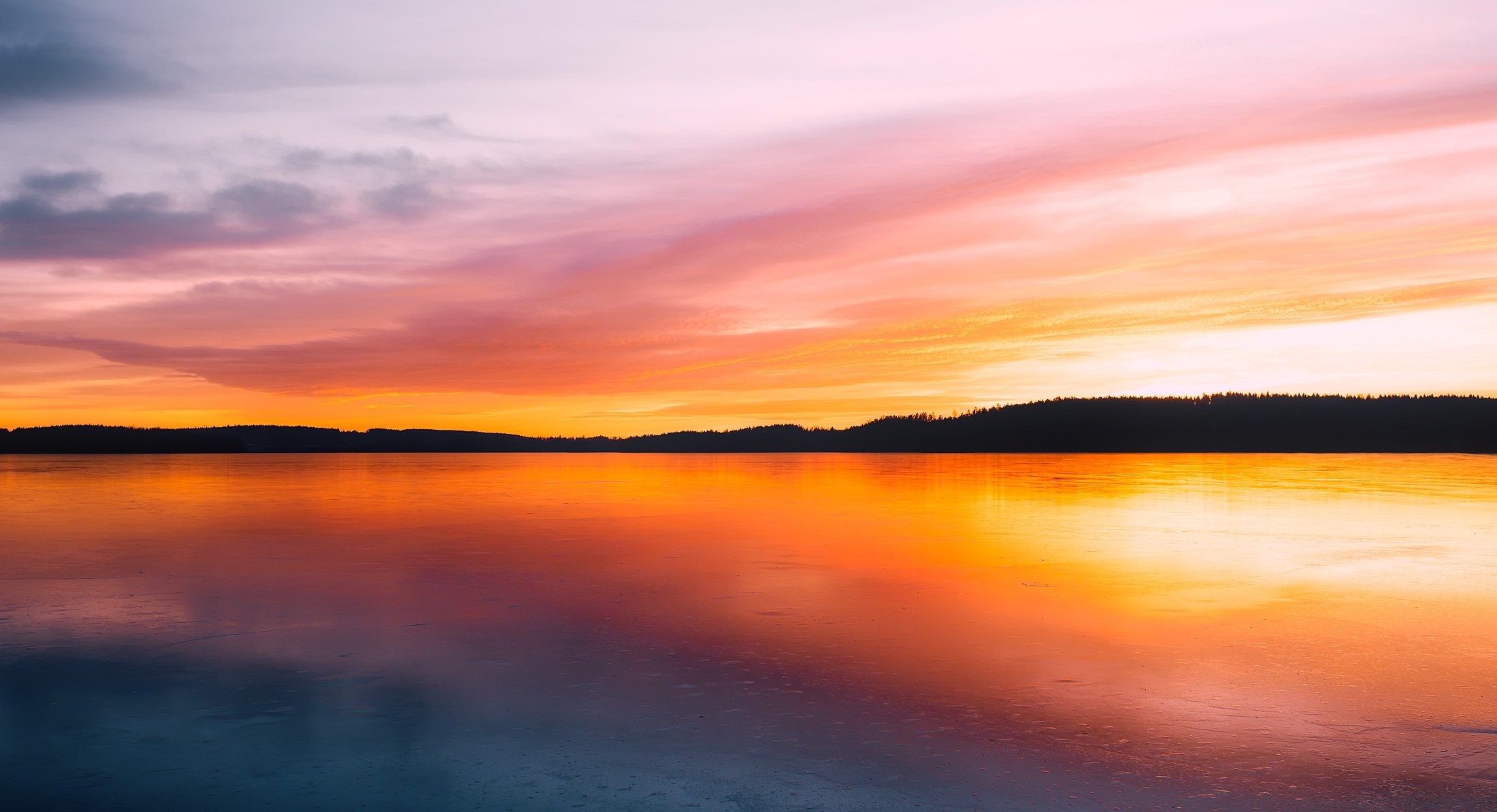
Analogous Color Scheme

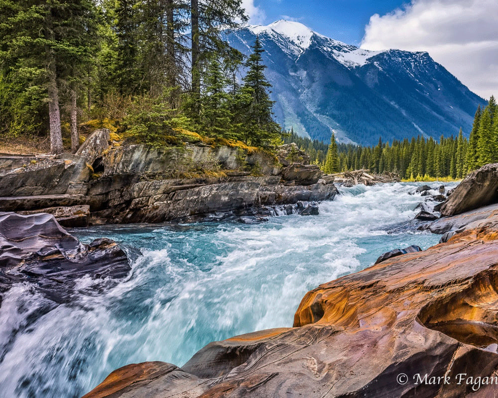
[/vc_column_text][vc_column_text]Analogous color schemes contain at least three colors that are located next to one another on the color wheel. Compositions that feature an analogous color scheme will usually have great harmony that create serene and comfortable designs. Analogous color schemes are commonly found nature (such as sunsets or landscapes).

To create an analogous color palette, first choose one color to be dominate, a second to support, and then a third supporting color. You may also use black, white, and grey as an accent.When creating an analogous color scheme, ensuring there is enough contrast between your colors is important to avoid the appearance of a monochromatic color palette.[/vc_column_text][/vc_column_inner][/vc_row_inner][vc_empty_space height=”15px”][vc_row_inner][vc_column_inner width=”1/3″][vc_empty_space height=”15px”][vc_single_image image=”60247″ img_size=”large”][/vc_column_inner][vc_column_inner width=”2/3″][vc_column_text]

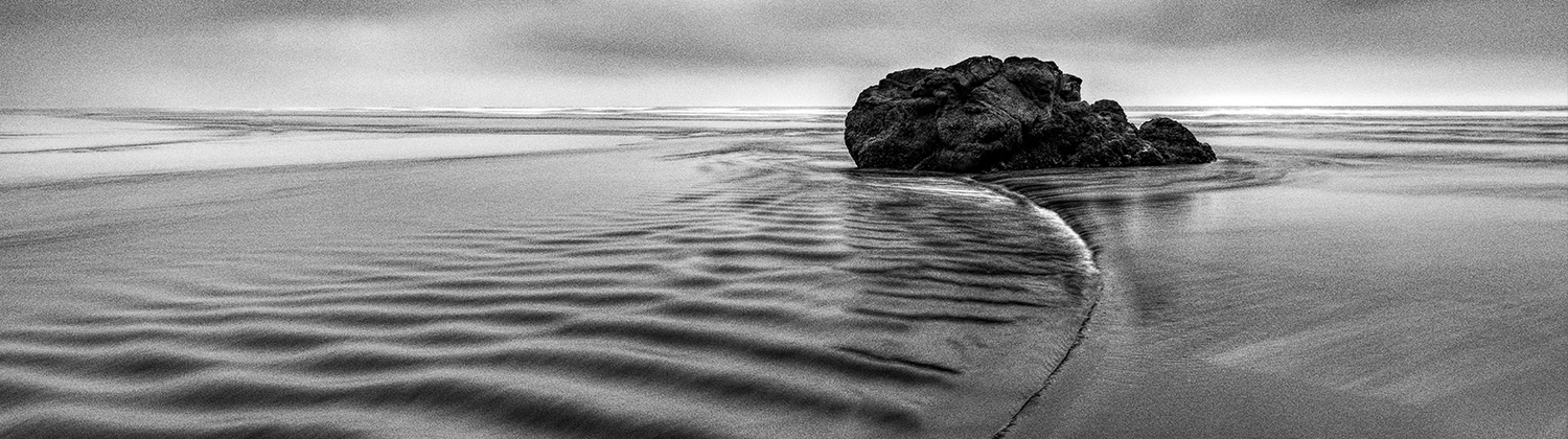
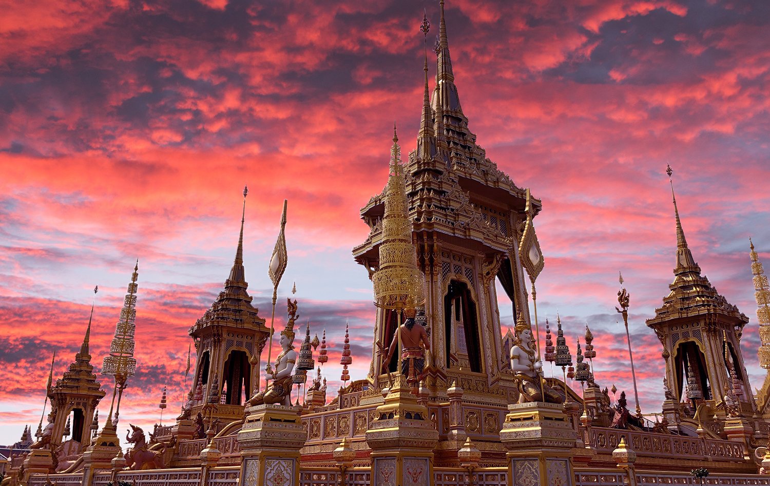
Complimentary Color Scheme

[/vc_column_text][vc_column_text]Colors that are opposite each other on the color wheel are considered to be complementary colors Examples of this are red and green, blue and orange, or violet and purple.

Complementary color palettes create high contrast and a very vibrant look when the color are used at full saturation. This color scheme can be difficult to achieve without becoming overpowering. This color scheme is great to use if you are wanting to create an area of emphasis within an image.[/vc_column_text][/vc_column_inner][/vc_row_inner][vc_empty_space height=”15px”][vc_row_inner][vc_column_inner width=”1/3″][vc_empty_space height=”15px”][vc_single_image image=”60256″ img_size=”large”][/vc_column_inner][vc_column_inner width=”2/3″][vc_column_text]

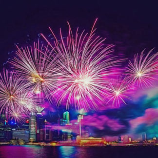
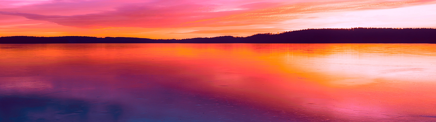
Triadic Color Scheme

[/vc_column_text][vc_column_text]A triadic color scheme contains three colors that are evenly spaced out around the color wheel. One example of this color scheme is red, blue, and yellow. This color scheme is known for being vibrant, even when using less saturated hues.

Creating an effective triadic color pallette can be difficult because careful balance is needed between the three hues. For the most effective displays of a triadic color scheme, use one dominant color and two accent colors.[/vc_column_text][/vc_column_inner][/vc_row_inner][vc_empty_space height=”15px”][vc_column_text]These are just three examples of color schemes and the three that I most often use. I suggest researching other effective color schemes if you would like to learn more about all the possibilities.

[/vc_column_text][vc_empty_space height=”15px”][vc_separator][vc_empty_space height=”15px”][vc_row_inner][vc_column_inner][vc_empty_space][vc_single_image image=”60350″ img_size=”large” alignment=”center”][vc_column_text]

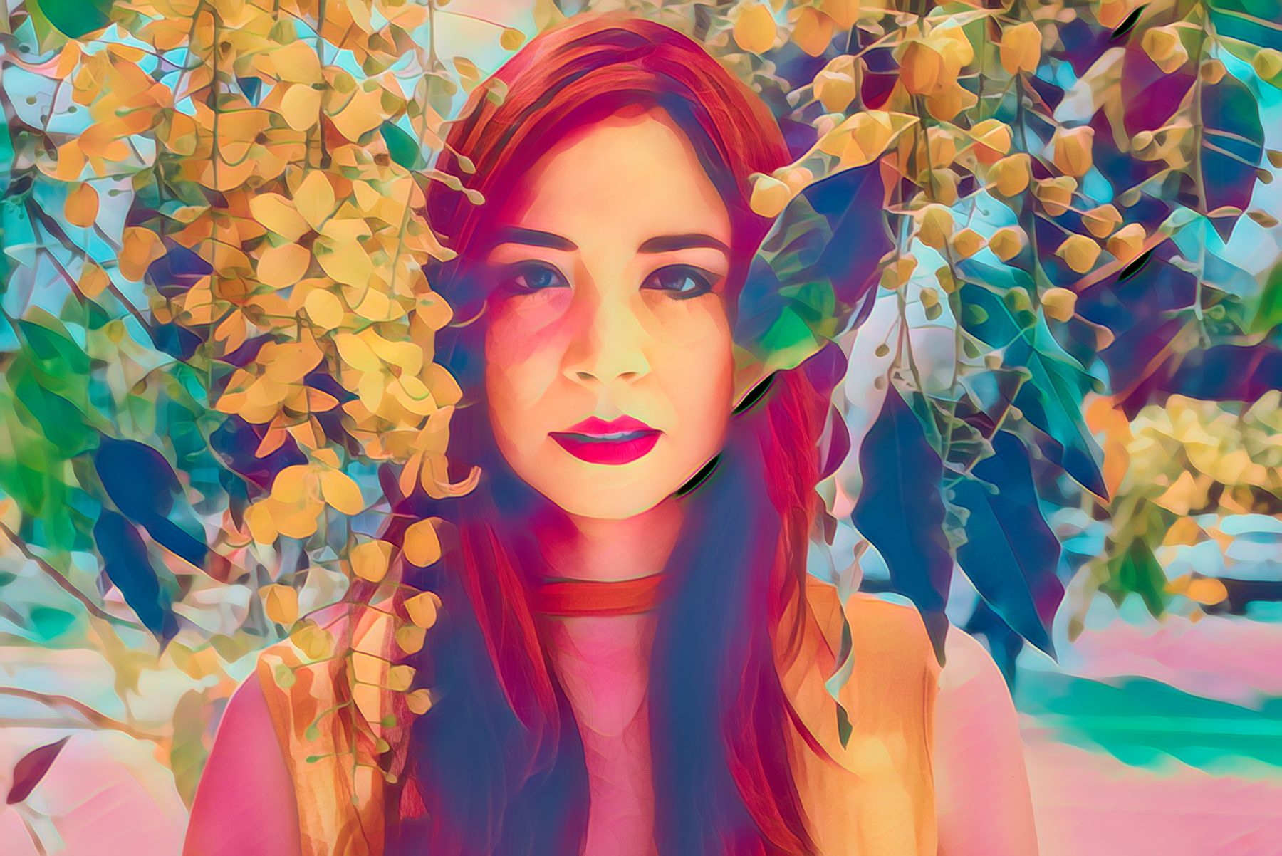
An image opened in Topaz Studio, edited with the Color Theme adjustment to have a complimentary color scheme. All panels are currently visible.

[/vc_column_text][vc_empty_space][/vc_column_inner][/vc_row_inner][/vc_column][/vc_row][vc_row][vc_column][vc_separator][vc_empty_space height=”15px”][vc_column_text]

The Basics

[/vc_column_text][vc_column_text]

The Color Theme Adjustment has a very different appearance than a lot of the other adjustments within Topaz Studio. Instead of the typical sliders you will see 10 swatches and a color picker that is followed by 3 sliders.

[/vc_column_text][vc_empty_space height=”15px”][vc_column_text]

How this Adjustment Works:

[/vc_column_text][vc_row_inner][vc_column_inner width=”1/4″][vc_empty_space height=”15px”][vc_empty_space height=”15px”][vc_empty_space height=”15px”][vc_single_image image=”60352″ img_size=”full” alignment=”center” onclick=”link_image”][/vc_column_inner][vc_column_inner width=”3/4″][vc_column_text]Row 1 of Swatches:
The first row of 5 swatches are colors pulled from your original image. You cannot edit these swatches. These five swatches are the 5 most dominant colors in your image and are ordered from darkest to lightest. The hex code of each color swatch is located beneath the swatch.

Row 2 of Swatches:
The second row of 5 swatches are the filter colors. You can change these swatches by clicking on each individual swatch and then selecting a new color from the color picker located below the swatches. If you are needing an exact color, you can input a hex code beneath each color swatch. If you ever need to reset a swatch, double clicking on it will reset it to its default value.

Lightness: 
This slider allows you to create a tint or shade of the selected color. Decreasing the value will create a darker shade, while increasing the value will create a lighter tint.

Details:
During the editing process, you may find that the small details were lost. This slider enables you to bring back the really fine details of the image.

Suppress Artifacts:
When drastically changing image color, you may notice some image artifacts occurring. Raising the value of the Suppress Artifacts slider will ensure those artifacts are blocked out.[/vc_column_text][/vc_column_inner][/vc_row_inner][vc_empty_space][/vc_column][/vc_row][vc_row][vc_column][vc_separator][vc_empty_space height=”15px”][vc_column_text]

Add the Color Theme Adjustment

[/vc_column_text][vc_empty_space height=”15px”][vc_column_text]NOTE: For this tutorial, we will be starting from scratch, so I’m going to close the effects panel and the workspace panel to allow more space to enlarge the image. You can do this by clicking on the border edge arrow. To open them back up, click again.

There are two ways to add the Color Theme Adjustment in Topaz Studio.

  1. Click the More Button in the Adjustment Buttons to show a list for all Adjustments. Click the Color Theme Adjustment to add it to your Adjustment Stack.
  2. Go to Menu > Adjustment > Color Theme Adjustment to add the Color Theme Adjustment.

[/vc_column_text][vc_empty_space][/vc_column][/vc_row][vc_row][vc_column][vc_separator][vc_empty_space height=”15px”][vc_column_text]

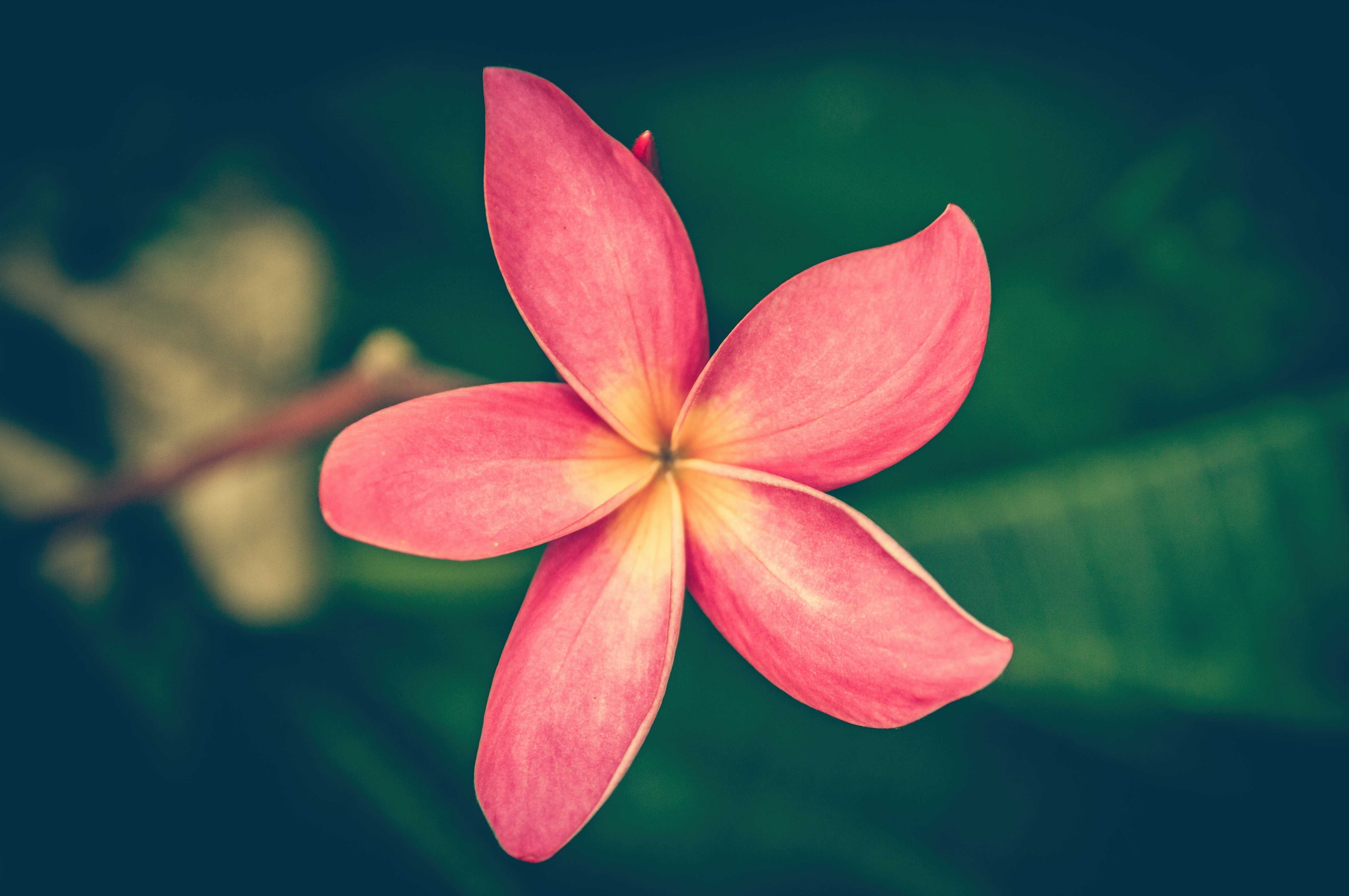
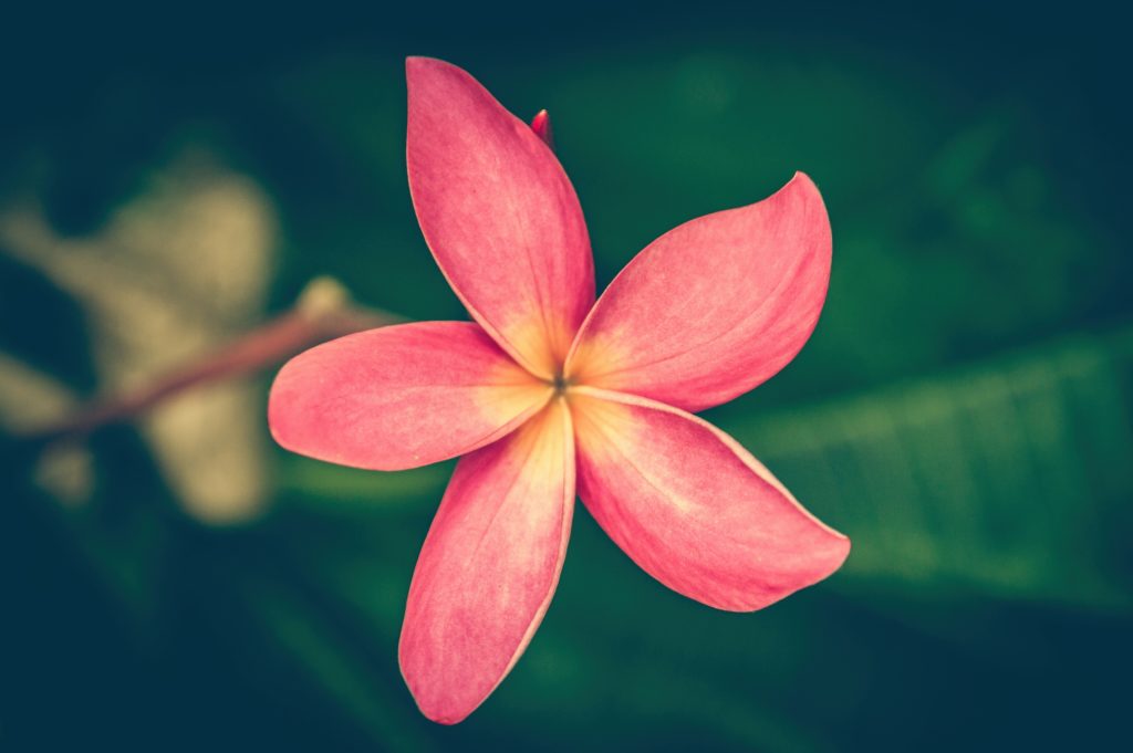
Adjust your Color Swatches

[/vc_column_text][vc_empty_space height=”15px”][vc_single_image image=”60366″ img_size=”large” alignment=”center”][vc_empty_space height=”15px”][vc_column_text]Tip: When picking what type of color scheme you’d like to create take into account the colors that are already existent in the image. Making less dramatic color shifts will result in a more natural overall edit.

Try It: After deciding what type of color scheme you are going for (in this case I chose a complimentary color scheme of red and green). Click the leftmost color swatch and work your way down the line changing each swatch to better harmonize your image. If you want your color to be lighter or darker, you can do so by moving the lightness slider to the left or right.

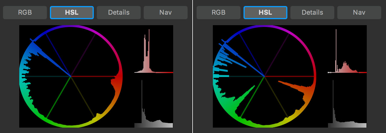
When adjusting color, I like to keep the HSL histogram visible during this editing process because it is very easy to see how you are affecting the overall color of your image.


How to use the Color Theme Adjustment[/vc_column_text][vc_column_text]

Histogram before and after the Color Theme Adjustment

[/vc_column_text][vc_empty_space][vc_row_inner][vc_column_inner width=”1/3″][vc_single_image image=”60386″ img_size=”large” onclick=”link_image”][/vc_column_inner][vc_column_inner width=”2/3″][vc_empty_space height=”15px”][vc_column_text]Here are the colors I used for the flower image. If you wish to mirror these settings, you can simply type in the hex codes from the second row of swatches directly into your corresponding swatches[/vc_column_text][/vc_column_inner][/vc_row_inner][vc_empty_space][vc_column_text]
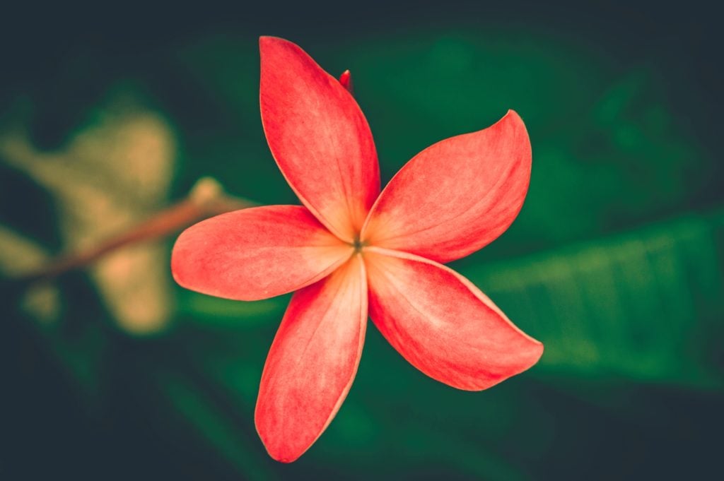
Before and After

[/vc_column_text][vc_column_text]

How to use the Color Theme Adjustment

[/vc_column_text][vc_column_text]

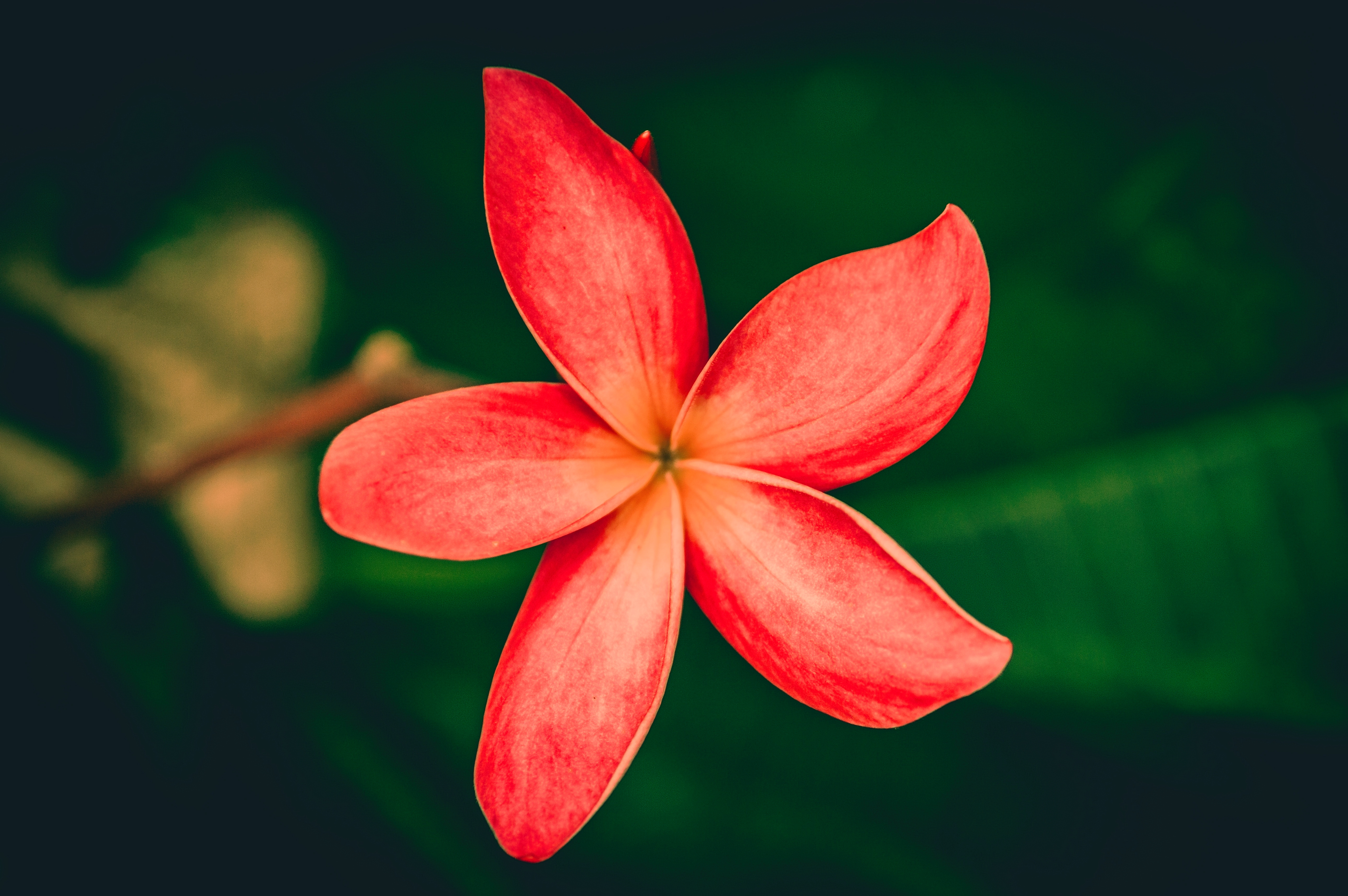
Here you can see how even a slight change in the color palette can make a drastic change.

[/vc_column_text][vc_empty_space][/vc_column][/vc_row][vc_row][vc_column][vc_separator][vc_empty_space height=”15px”][vc_column_text]

Change the Blending Mode

[/vc_column_text][vc_empty_space height=”15px”][vc_single_image image=”60393″ img_size=”large” alignment=”center”][vc_empty_space height=”15px”][vc_column_text]While I’m satisfied with the color I changed the flower to, I feel it doesn’t look very natural especially in the shadows. They seem too oversaturated for me. A great way to fix this is by changing the blending mode and opacity of the Color Theme Adjustment.

Try It: Click through the blending modes and see how each one affects your image. Experiment with some of your favorites to see what effects you can create with them. Some of my favorite blending modes are the Darker Color, Overlay, Soft Light, Saturation, and Color Blending Modes.[/vc_column_text][vc_empty_space][vc_row_inner][vc_column_inner width=”1/4″][vc_single_image image=”60394″ img_size=”large” alignment=”center” onclick=”link_image”][vc_column_text]

Normal

[/vc_column_text][/vc_column_inner][vc_column_inner width=”1/4″][vc_single_image image=”60396″ img_size=”large” onclick=”link_image”][vc_column_text]

Color

[/vc_column_text][/vc_column_inner][vc_column_inner width=”1/4″][vc_single_image image=”60399″ img_size=”large” onclick=”link_image”][vc_column_text]

Saturation

[/vc_column_text][/vc_column_inner][vc_column_inner width=”1/4″][vc_single_image image=”60400″ img_size=”large” onclick=”link_image”][vc_column_text]

Soft Light

[/vc_column_text][/vc_column_inner][/vc_row_inner][vc_empty_space][vc_column_text]

Before and After

[/vc_column_text][vc_column_text]I chose to go with the Color Blending Mode for this image, I felt like it created the most natural result.

[/vc_column_text][vc_empty_space height=”15px”][vc_column_text]

How to use the Color Theme Adjustment

How to use the Color Theme Adjustment

[/vc_column_text][vc_column_text]

The Color Blending Mode creates a more natural effect.

[/vc_column_text][vc_empty_space][/vc_column][/vc_row][vc_row][vc_column][vc_separator][vc_empty_space height=”15px”][vc_column_text]

Final Tweaks

[/vc_column_text][vc_empty_space height=”15px”][vc_column_text]

Opacity Slider

[/vc_column_text][vc_row_inner][vc_column_inner width=”1/3″][vc_empty_space height=”15px”][vc_empty_space height=”15px”][vc_single_image image=”60416″ img_size=”large” onclick=”link_image”][/vc_column_inner][vc_column_inner width=”2/3″][vc_column_text]There is an Adjustment Level Opacity Slider located on each adjustment’s title bar. You can use this to change the opacity of each individual adjustment.

Try It: Select the Opacity Slider and move it left and right to see how it affects your overall image. Once you are satisfied with the look of your image, move down to the Details Slider.[/vc_column_text][/vc_column_inner][/vc_row_inner][vc_empty_space height=”15px”][vc_column_text]

Detail and Suppress Artifacts Slider

[/vc_column_text][vc_row_inner][vc_column_inner width=”1/3″][vc_empty_space height=”15px”][vc_empty_space height=”15px”][vc_empty_space][vc_single_image image=”60418″ img_size=”large” onclick=”link_image”][/vc_column_inner][vc_column_inner width=”2/3″][vc_column_text]Located at the bottom of the Color Theme Adjustment Panel is the Detail and Suppress Artifacts Sliders. The Detail Slider affects very minute details, so if you are needing overall image sharpening, I suggest checking out our Precision Contrast or Sharpen Adjustment. After you are satisfied with the Detail Slider, move on to the Suppress Artifacts Slider. This isn’t always necessary, but I always add a little touch of this slider just to make sure my images are crystal clear.

Try It: Move the sliders left and right and see how it affects the details in your image. If you are working on a larger image, I would suggest zooming in. The changes will be much more apparent.[/vc_column_text][/vc_column_inner][/vc_row_inner][vc_row_inner][vc_column_inner width=”1/2″][vc_empty_space height=”15px”][vc_single_image image=”60423″ img_size=”large” onclick=”link_image”][vc_column_text]

Before Detail Slider

[/vc_column_text][/vc_column_inner][vc_column_inner width=”1/2″][vc_empty_space height=”15px”][vc_single_image image=”60421″ img_size=”large” onclick=”link_image”][vc_column_text]

After Detail Slider

[/vc_column_text][/vc_column_inner][/vc_row_inner][vc_empty_space height=”15px”][vc_column_text]

Final Result

[/vc_column_text][vc_column_text]

How to use the Color Theme Adjustment

How to use the Color Theme Adjustment

[/vc_column_text][vc_empty_space][/vc_column][/vc_row][vc_row][vc_column][vc_separator][vc_empty_space height=”15px”][vc_column_text]

Gallery

[/vc_column_text][vc_column_text]Here’s some other images that I created using the Color Theme Adjustment. While I don’t go over any of these in this blog article, I do go over the waterfall image in the video tutorial. I was able to achieve all these effects with only the Color Theme Adjustment and a little bit of the Topaz Studio Integrated Masking. I’ve also shared the 5 Color Theme Adjustments I used as one effect called Color Theme Basic Tutorial. You can find this effect by searching it in the Topaz Studio Community.

The corresponding adjustments are listed top to bottom: Red Flower, Rainbow Water, Chameleon, Tulips, and Waterfall. Just simply turn off or delete the color theme adjustments you wish to not use.[/vc_column_text][vc_empty_space height=”15px”][vc_row_inner][vc_column_inner width=”1/2″][vc_single_image image=”60449″ img_size=”large” onclick=”link_image”][vc_empty_space height=”15px”][vc_single_image image=”60439″ img_size=”large” onclick=”link_image”][vc_empty_space height=”15px”][vc_single_image image=”60444″ img_size=”large” onclick=”link_image”][/vc_column_inner][vc_column_inner width=”1/2″][vc_single_image image=”60450″ img_size=”large” onclick=”link_image”][vc_empty_space height=”15px”][vc_single_image image=”60440″ img_size=”large” onclick=”link_image”][vc_empty_space height=”15px”][vc_single_image image=”60443″ img_size=”large” onclick=”link_image”][/vc_column_inner][/vc_row_inner][vc_empty_space][/vc_column][/vc_row][vc_row][vc_column][vc_column_text]

That’s It!

[/vc_column_text][vc_column_text]From bold and colorful to subtle and realistic, the Color Theme Adjustment has the ability to achieve it. I hope I’ve inspired you to try out new things within the Color Theme Adjustment and realize the endless possibilities within Topaz Studio.

We’ll also be adding more tutorials and videos so be sure to give us a follow to learn more!

If you’d like to share your images with us, tag us on Instagram with @topazlabs and Twitter with @topazlabs. We’re also on Facebook and YouTube![/vc_column_text][vc_empty_space][/vc_column][/vc_row][vc_row][vc_column][vc_empty_space height=”15px”][vc_separator border_width=”3″][vc_empty_space height=”15px”][vc_column_text]

About Taylor L. Seaton

[/vc_column_text][vc_empty_space height=”15px”][vc_row_inner][vc_column_inner width=”1/4″][vc_single_image image=”8720″ img_size=”” alignment=”center” style=”vc_box_circle_2″][/vc_column_inner][vc_column_inner width=”3/4″][vc_column_text]

Taylor Seaton is a 2016 graduate from Angelo State University. While attending ASU, she obtained her Bachelor of Fine Arts with a concentration in Graphic Design and an area of emphasis in Business Management and Marketing. She also played volleyball at the collegiate level. She is currently the Social Media Manager at Topaz Labs.

[/vc_column_text][/vc_column_inner][/vc_row_inner][vc_empty_space height=”15px”][vc_separator border_width=”3″][vc_empty_space height=”15px”][/vc_column][/vc_row]

Posted on 2 Comments

Behind the Facade by Alister Benn

Behind the Facade

[vc_row][vc_column][vc_column_text]

Who am I?

Who am I?

Am I a suit and a clean pair of shoes, punctual and articulate, or am I sleeping in the rain under a bridge in Glencoe? Am I Scottish, British or European? If I drop some money into the cup of a homeless person does that make me compassionate, or do I do that to appear compassionate? Does wearing black make me boring, or daring, a rebel or unimaginative? – Who am I? – You tell me, your perspective of these things defines who you think I am.

[/vc_column_text][vc_empty_space height=”15px”][qodef_blockquote text=”Who am I? – You tell me, your perspective of these things defines who you think I am.” title_tag=”h3″][vc_empty_space][/vc_column][/vc_row][vc_row][vc_column][vc_row_inner][vc_column_inner][vc_single_image image=”57456″ img_size=”large” alignment=”center”][vc_column_text]

Lost in Paradise

[/vc_column_text][vc_empty_space][/vc_column_inner][/vc_row_inner][vc_column_text]

Why ask yourself these questions?

[/vc_column_text][vc_empty_space height=”15px”][vc_column_text]

I make photographs for a living, and I ask these questions because as soon as we share a photograph, it and us get judged. Other people rate our work, they critique it, they make suggestions for improvement based on their perspective of our perspective and on the most basic level they make a decision of “I like that,” or “I don’t like that.” Judging is endless in photography: Is it photoshopped, is that real, that’s not a photograph, it’s a digital creation, if it’s not film it’s not a photograph etc. Much of contemporary photography is a popularity contest, which leads people to make images that in all likelihood will be popular, following the lowest common denominator principle. Judging is a fundamental of human nature – we do it all the time, usually with our first impression, which people refer to as their gut. “I always trust my gut, it’s never wrong!”

[/vc_column_text][/vc_column][/vc_row][vc_row][vc_column][vc_empty_space][vc_row_inner][vc_column_inner][vc_single_image image=”57458″ img_size=”large” alignment=”center”][vc_empty_space][/vc_column_inner][/vc_row_inner][vc_column_text]

We choose the bits we want to show.

[/vc_column_text][vc_empty_space height=”15px”][vc_column_text]

In my mind however, I believe photographs, like words can be a facade; something we choose to show someone else with our intention as a desired impact. Whether they represent the honest opinion of the photographer or the whole story is immaterial. For years I called landscape photography “lying by omission” as we choose to isolate the bits we want to show to tell our stories. How often do we compose the washed up plastic on a beach in our seascapes? There is no guarantee of truth in photography, only the contents of the frame.

[/vc_column_text][vc_empty_space height=”15px”][qodef_blockquote text=”I believe photographs, like words can be a facade.” title_tag=”h3″][vc_empty_space height=”15px”][/vc_column][/vc_row][vc_row][vc_column][vc_row_inner][vc_column_inner][vc_empty_space][vc_single_image image=”57466″ img_size=”large” alignment=”center”][vc_column_text]

Land of Giants

[/vc_column_text][vc_empty_space][/vc_column_inner][/vc_row_inner][vc_column_text]

Photographers are storytellers.

[/vc_column_text][vc_empty_space height=”15px”][vc_column_text]

I would say the photographers I admire are great story-tellers, taking me on journeys, both literal and metaphorical, emotional and tangible. Do their images give me an insight to their personalities, or their true self? Perhaps, but not necessarily. I try not to judge! I can say I don’t like something, but that doesn’t mean it’s bad. What is important for me when I view an image is “how does this make me feel?”

[/vc_column_text][vc_empty_space height=”15px”][qodef_blockquote text=”How does this make me feel?” title_tag=”h3″][vc_empty_space height=”15px”][/vc_column][/vc_row][vc_row][vc_column][vc_row_inner][vc_column_inner][vc_empty_space][vc_single_image image=”57470″ img_size=”large” alignment=”center”][vc_column_text]

The Promise

[/vc_column_text][vc_empty_space][/vc_column_inner][/vc_row_inner][vc_column_text]

How does it make them feel?

[/vc_column_text][vc_empty_space height=”15px”][vc_column_text]

When people view our work what type of words are they going to use to describe how they feel? “I love the mood, the energy, the emotion, the mystery, the drama, the sense of adventure” are all adjectives. Only photographers occasionally use technical language in these descriptions, but you don’t often get “I love the fact you used ISO 64 to make this photograph!”

[/vc_column_text][vc_empty_space height=”15px”][qodef_blockquote text=”When people view our work what type of words are they going to use to describe how they feel?” title_tag=”h3″][vc_empty_space height=”15px”][/vc_column][/vc_row][vc_row][vc_column][vc_row_inner][vc_column_inner][vc_empty_space][vc_single_image image=”57472″ img_size=”large” alignment=”center”][vc_column_text]

Magnetic Fields

[/vc_column_text][vc_empty_space][/vc_column_inner][/vc_row_inner][vc_column_text]

We should put those feelings into our work.

[/vc_column_text][vc_empty_space height=”15px”][vc_column_text]

If people are going to use adjectives to describe the impact of your work on them, it stands to reason that we should put those adjectives into our work at the front end during capture and/or processing. When I am working images I make a decision on what I want to say. I use adjectives like the ones listed above to make creative decisions on how the final image will look and feel. Is this based on reality of the event? Sometimes, or partly, or not at all. It purely depends on the facade of the day. The physical geography of the landscape remains unchanged, it is a graphical template on which to dodge and burn my expressive artistic intention.

[/vc_column_text][vc_empty_space height=”15px”][qodef_blockquote text=”When I am working images I make a decision on what I want to say. I use adjectives like the ones listed above to make creative decisions on how the final image will look and feel.” title_tag=”h3″][vc_empty_space height=”15px”][/vc_column][/vc_row][vc_row][vc_column][vc_empty_space][vc_row_inner][vc_column_inner][vc_single_image image=”57461″ img_size=”large” alignment=”center”][vc_empty_space][/vc_column_inner][/vc_row_inner][vc_column_text]

Who am I?

[/vc_column_text][vc_empty_space height=”15px”][vc_column_text]

Am I a suit and a clean pair of shoes, punctual and articulate? – yes, if I’m going into a negotiation.

Am I sleeping in the rain under a bridge in Glencoe? – yes when I was discovering Scotland’s landscape as a teenager.

Is our artistic intention to make people feel happy, sad, lonely, inquisitive, motivated, inspired, challenged? – yes, sometimes. We are a sum of many parts, changing with the seasons and each passing breath. We have the right to change our minds and be influenced by others.  We have the right to say one thing and do another! The facade may or may not represent who we really are.

[/vc_column_text][vc_empty_space height=”15px”][qodef_blockquote text=”We have the right to change our minds and be influenced by others. We have the right to say one thing and do another!” title_tag=”h3″][/vc_column][/vc_row][vc_row][vc_column][vc_empty_space][vc_column_text]

Gallery

[/vc_column_text][vc_column_text]More images from Alister Benn. Enjoy![/vc_column_text][vc_empty_space][vc_row_inner][vc_column_inner width=”1/3″][vc_single_image image=”57476″ img_size=”large” alignment=”center”][vc_empty_space height=”15px”][vc_single_image image=”56843″ img_size=”large” alignment=”center”][/vc_column_inner][vc_column_inner width=”1/3″][vc_single_image image=”57477″ img_size=”large” alignment=”center”][vc_empty_space height=”15px”][vc_single_image image=”57478″ img_size=”large” alignment=”center”][vc_empty_space height=”15px”][vc_single_image image=”57479″ img_size=”large” alignment=”center”][vc_empty_space height=”15px”][vc_single_image image=”57485″ img_size=”large” alignment=”center”][/vc_column_inner][vc_column_inner width=”1/3″][vc_single_image image=”57492″ img_size=”large” alignment=”center”][vc_empty_space height=”15px”][vc_single_image image=”57493″ img_size=”large” alignment=”center”][/vc_column_inner][/vc_row_inner][/vc_column][/vc_row][vc_row][vc_column][vc_empty_space][vc_separator border_width=”3″][vc_empty_space height=”15px”][vc_column_text]

About Alister Benn

[/vc_column_text][vc_empty_space height=”15px”][vc_row_inner][vc_column_inner width=”1/6″][vc_single_image image=”56813″ img_size=”medium” alignment=”center” style=”vc_box_circle_2″][/vc_column_inner][vc_column_inner width=”5/6″][vc_empty_space height=”15px”][vc_column_text]Alister Benn is an award winning Scottish landscape photographer, author, educator, and guide. He lives on the isle of Skye off the north west coast of Scotland with his wife Juanli Sun. Each year they lead small group workshops and tours to select locations around the Scottish Highlands, Southern Iceland, Northern Spain and of course Tibet and the Himalaya.

Tours & Workshops | Portfolio | Facebook PageNewsletter[/vc_column_text][/vc_column_inner][/vc_row_inner][vc_empty_space height=”15px”][vc_separator border_width=”3″][vc_empty_space height=”15px”][/vc_column][/vc_row][vc_row][vc_column][vc_empty_space][vc_column_text]

Thanks for Reading!

[/vc_column_text][vc_column_text]That’s all we have for today! If you’ve been inspired, feel free to comment on this post or share your own thoughts with us on one of our social media channels you can reach us on Instagram with @topazlabs and Twitter with @topazlabs. We’re also on Facebook and YouTube! We look forward to sharing the rest of Alister Benn’s year in the very near future, but until then![/vc_column_text][/vc_column][/vc_row][vc_row][vc_column][vc_empty_space][vc_column_text]

Free Download

[/vc_column_text][vc_column_text]Feel free to download our brand new product, Topaz Studio, the all-in-one photo editor. It works as a plugin, a host editor for your Topaz products, and a standalone editor. Best of all it’s completely free to use![/vc_column_text][vc_empty_space height=”15px”][vc_row_inner][vc_column_inner width=”1/2″][vc_btn title=”Windows” shape=”square” color=”primary” align=”center” button_block=”true” link=”url:https%3A%2F%2Fopen_beta.s3.amazonaws.com%2Ftopazstudio_online_installer.exe|||”][/vc_column_inner][vc_column_inner width=”1/2″][vc_btn title=”Mac” shape=”square” color=”primary” align=”center” button_block=”true” link=”url:https%3A%2F%2Fopen_beta.s3.amazonaws.com%2Ftopazstudio_online_installer.dmg|||”][/vc_column_inner][/vc_row_inner][/vc_column][/vc_row]

Posted on

How to Use the Film Grain Adjustment

How to use the Film Grain Adjustment

[vc_row][vc_column][vc_empty_space][vc_column_text]Tutorial created Topaz Studio V1.0.9[/vc_column_text][vc_column_text]

What is the Film Grain Adjustment?

[/vc_column_text][vc_empty_space height=”15px”][vc_column_text]The Topaz Studio Film Grain Adjustment makes it completely effortless to to create a vintage effect on images. Digital photography has eliminated certain elements such as film grain, traditionally found in film photography. Add that traditional, nostalgic feel and interesting surface texture back into images. For many of you not familiar with film gain, I’ll give you a little bit of the history behind it.

What is Film Grain? Film grain is a random texture that is found on processed photography film due to small particles of metallic silver being present during processing. These particles developed from silver halide which received enough protons during the photography process.

Why add it? Adding film grain to digital photos will make images appear as if they were developed in a dark room. Film grain also works great in small amounts to remove the plastic look from subjects.[/vc_column_text][/vc_column][/vc_row][vc_row][vc_column][vc_empty_space][vc_column_text]

Free Download

[/vc_column_text][vc_empty_space height=”15px”][vc_column_text]The Film Grain Adjustment is available within Topaz Studio as a Free Adjustment. If you’d like to check out everything that is free within Topaz Studio, I suggest checking out our What’s Free article. If you’d like to follow along with the Film Grain Adjustment, you can click the links below to download Topaz Studio.[/vc_column_text][vc_empty_space height=”15px”][vc_row_inner][vc_column_inner width=”1/2″][vc_btn title=”Windows” shape=”square” color=”primary” align=”center” button_block=”true” link=”url:https%3A%2F%2Ftopazlabs.com%2Ffilm-grain%2Fref%2F47%2F%3Fcampaign%3DFilmGrain_07%2F2017_Blog_FilmGrainPage|||”][/vc_column_inner][vc_column_inner width=”1/2″][vc_btn title=”Mac” shape=”square” color=”primary” align=”center” button_block=”true” link=”url:https%3A%2F%2Ftopazlabs.com%2Ffilm-grain%2Fref%2F47%2F%3Fcampaign%3DFilmGrain_07%2F2017_Blog_FilmGrainPage|||”][/vc_column_inner][/vc_row_inner][/vc_column][/vc_row][vc_row][vc_column][vc_empty_space][vc_column_text]

What We Will Cover in This Tutorial

[/vc_column_text][vc_empty_space height=”15px”][vc_column_text]1. Basic Usage of the Film Grain Adjustment

2. How to Edit with the Film Grain Adjustment

3. Editing Skin with the Film Grain Adjustment[/vc_column_text][/vc_column][/vc_row][vc_row][vc_column][vc_empty_space][vc_column_text]

Reading not your Thing? Watch the Full Tutorial!

[/vc_column_text][vc_column_text]If you’d like a more hands on approach to learning the Film Grain Adjustment, check out this short tutorial video. Hope you enjoy.[/vc_column_text][vc_empty_space height=”15px”][vc_video link=”https://youtu.be/F14ksoQw5iU”][vc_empty_space][/vc_column][/vc_row][vc_row][vc_column][vc_column_text]

1. Basic Usage of the Film Grain Adjustment

[/vc_column_text][vc_row_inner][vc_column_inner width=”2/3″][vc_empty_space height=”15px”][vc_single_image image=”57369″ img_size=”large” onclick=”link_image”][/vc_column_inner][vc_column_inner width=”1/3″][vc_empty_space][vc_column_text]The film Grain Adjustment features 3 sliders and 2 grain color options to allow complete control on how the film grain will affect your image. After applying the Film Grain Adjustment to your image, you will see a 3 slider panel pop up in the adjustments panel.[/vc_column_text][/vc_column_inner][/vc_row_inner][vc_empty_space][/vc_column][/vc_row][vc_row][vc_column][vc_column_text]

Breakdown of the Sliders

[/vc_column_text][vc_empty_space][vc_row_inner][vc_column_inner width=”1/4″][vc_empty_space][vc_empty_space][vc_single_image image=”57370″ img_size=”large” onclick=”link_image”][/vc_column_inner][vc_column_inner width=”3/4″][vc_column_text]

The sliders and what they do:

1. Strength:
Easily add film grain with the Strength slider. Simply increase the value of the Strength slider and the image will become more grainy.

2. Size:
Choose the size of the grain with the Size slider. Increasing the value of the slider will create larger grain, while decreasing the value of the slider will create smaller grain.

3. Randomness:
Choose how uniform the grain is. Increasing the value of this slider will result in a more random pattern of grain, while decreasing the value of this slider will create a more uniform grain.

4. Noise Type:
The noise type toggle controls whether the grain added will be only gray (monochromatic) or will be colored. I typically use the grey grain for black and white images and the colored grain for colored images.

[/vc_column_text][/vc_column_inner][/vc_row_inner][vc_empty_space][/vc_column][/vc_row][vc_row][vc_column][vc_column_text]

Open Your Image

[/vc_column_text][vc_empty_space height=”15px”][vc_row_inner][vc_column_inner][vc_empty_space height=”15px”][vc_single_image image=”57087″ img_size=”full” alignment=”center” onclick=”link_image”][vc_empty_space][vc_column_text]Before we get started, you’ll want to open an image. If this is your first time opening Topaz Studio, you’ll notice that there is a lot of empty fields. This is because you’ll need to open an image to get started! There is more than one way that you can open an image .

  1. Drag and drop an image from your computer into the program.
  2. Click Open (located in the Canvas) and navigate through your files. Select an image and click Open.
  3. Click Open in the menu bar. Select an image and click Open.
  4. Go to Menu > File > Open Image… and then select an image and click Open.
  5. Use your shortcut keys (such as Command O or Control O).

[/vc_column_text][/vc_column_inner][/vc_row_inner][vc_empty_space][/vc_column][/vc_row][vc_row][vc_column][vc_column_text]

Apply the Film Grain Adjustment to Your Image

[/vc_column_text][vc_row_inner][vc_column_inner width=”2/3″][vc_empty_space height=”15px”][vc_single_image image=”57136″ img_size=”large” onclick=”link_image”][/vc_column_inner][vc_column_inner width=”1/3″][vc_empty_space][vc_column_text]After you have successfully opened an image, you will want to apply the Film Grain Adjustment. This can be done one of two ways:

  1. Clicking Adjustments > Film Grain  from the top Menu Bar.
  2. Clicking More > Film Grain from the Adjustment tool bar located on the right-hand side of your workspace.

[/vc_column_text][/vc_column_inner][/vc_row_inner][vc_empty_space][/vc_column][/vc_row][vc_row][vc_column][vc_column_text]

2. Editing with Film Grain

[/vc_column_text][vc_row_inner][vc_column_inner][vc_empty_space height=”15px”][vc_single_image image=”57369″ img_size=”large” alignment=”center” onclick=”link_image”][vc_empty_space][vc_column_text]If you are planning on adding Film Grain to an image, I would suggest adding it towards the end of the workflow. If you add Film Grain at the bottom of your Adjustment stack, you may see other Adjustments like Precision Contrast (will make the grain stronger) or Reduce Noise (will remove the grain) impact the Film Grain Adjustment. After I added the Film Grain Adjustment, I increased the Size and Strength slider, as well as the randomizer (for a more natural effect) until I was satisfied. I chose to make this grain very visible to give it a really nostalgic feeling.[/vc_column_text][/vc_column_inner][/vc_row_inner][vc_empty_space][/vc_column][/vc_row][vc_row][vc_column][vc_column_text]

The Settings

[/vc_column_text][vc_row_inner][vc_column_inner width=”1/4″][vc_empty_space height=”15px”][vc_single_image image=”57376″ img_size=”large” onclick=”link_image”][/vc_column_inner][vc_column_inner width=”3/4″][vc_empty_space][vc_empty_space][vc_column_text]Here are the settings I used for the Film Grain Adjustment. I would suggest using settings similar to this for very smooth images that you wish to add heavier film grain to.[/vc_column_text][/vc_column_inner][/vc_row_inner][vc_empty_space][vc_column_text]

The Before and After:

[/vc_column_text][vc_empty_space height=”15px”][vc_column_text]I love how this turned out! Reminds me of some of the old photos I find when visiting my grandma.[/vc_column_text][vc_empty_space height=”15px”][vc_row_inner][vc_column_inner width=”1/2″][vc_single_image image=”57138″ img_size=”large” alignment=”center” onclick=”link_image”][vc_empty_space height=”15px”][vc_column_text]

Before

[/vc_column_text][/vc_column_inner][vc_column_inner width=”1/2″][vc_single_image image=”57139″ img_size=”large” alignment=”center” onclick=”link_image”][vc_empty_space height=”15px”][vc_column_text]

After

[/vc_column_text][/vc_column_inner][/vc_row_inner][vc_empty_space][/vc_column][/vc_row][vc_row][vc_column][vc_column_text]

3. Enhancing Skin with Film Grain

[/vc_column_text][vc_column_text]We will be editing the image of this woman below. Her skin looks flawless, but it looks a little too perfect to me. I would like to create a more natural effect. When I’m adding skin texture to colored image, I choose the colored film grain. It creates a much more natural effect.[/vc_column_text][vc_empty_space height=”15px”][vc_single_image image=”57119″ img_size=”large” alignment=”center” onclick=”link_image”][vc_empty_space height=”15px”][vc_row_inner][vc_column_inner width=”1/4″][vc_empty_space height=”15px”][vc_empty_space height=”15px”][vc_single_image image=”57378″ img_size=”large” onclick=”link_image”][/vc_column_inner][vc_column_inner width=”3/4″][vc_column_text]For the first part of this tutorial, I wanted to make sure you were familiar with the Film Grain Controls. For the next part, we will be doing a little bit more advanced effect that uses Topaz Studio’s Integrated Masking.

Built in Functionality. Topaz Studio has a lot of functionality that allows you to perfect how each adjustment affects your image. The functionality is built right into the header next to its name. You will find adjustment level masking, an opacity slider, 28 blending modes, and the ability to duplicate the adjustment![/vc_column_text][/vc_column_inner][/vc_row_inner][vc_empty_space height=”15px”][/vc_column][/vc_row][vc_row][vc_column][vc_column_text]

Add Film Grain to Your Image

[/vc_column_text][vc_row_inner][vc_column_inner width=”2/3″][vc_empty_space height=”15px”][vc_single_image image=”57154″ img_size=”large” alignment=”center” onclick=”link_image”][/vc_column_inner][vc_column_inner width=”1/3″][vc_empty_space][vc_empty_space][vc_empty_space][vc_column_text]Again, I added the Film Grain Adjustment and increased the strength and size slightly, but really increased the Randomizer Slider to give a more natural skin texture.[/vc_column_text][/vc_column_inner][/vc_row_inner][vc_empty_space][/vc_column][/vc_row][vc_row][vc_column][vc_column_text]

The Settings

[/vc_column_text][vc_row_inner][vc_column_inner width=”1/4″][vc_empty_space height=”15px”][vc_single_image image=”57379″ img_size=”large” onclick=”link_image”][/vc_column_inner][vc_column_inner width=”3/4″][vc_empty_space][vc_empty_space][vc_empty_space][vc_column_text]Here are the settings I used for the Film Grain Adjustment. Don’t forget to switch the toggle to colored grain![/vc_column_text][/vc_column_inner][/vc_row_inner][vc_empty_space][vc_column_text]

Adjustment Level Masking

[/vc_column_text][vc_empty_space height=”15px”][vc_row_inner][vc_column_inner width=”1/6″][vc_empty_space height=”15px”][vc_empty_space height=”15px”][vc_single_image image=”46805″ img_size=”large” alignment=”center” onclick=”link_image”][/vc_column_inner][vc_column_inner width=”5/6″][vc_column_text]Next, I am going to slightly mask the highlights and shadows on our subject to create a more natural effect. I’m going to use the adjustment level masking to accomplish this task. To do so, just click on the adjustment level masking icon in the adjustment panel (shown on the left). After you have opened your masking panel, select the luminosity mask.

Not familiar with masking? If you aren’t very familiar with masking, I suggest you check out this masking tutorial over the Topaz Studio Masking here[/vc_column_text][/vc_column_inner][/vc_row_inner][vc_empty_space][vc_column_text]

Using the Luminosity Mask

[/vc_column_text][vc_row_inner][vc_column_inner width=”1/4″][vc_empty_space height=”15px”][vc_single_image image=”57127″ img_size=”large” alignment=”center” onclick=”link_image”][/vc_column_inner][vc_column_inner width=”3/4″][vc_empty_space][vc_empty_space][vc_column_text]I chose to use the Luminosity Mask because it is the most effective way to select a certain luminosity of an image (in our case the mid-tones) and create the most natural transition. The settings I used for this particular mask are shown to the left. Once you are satisfied with you mask, just click done![/vc_column_text][/vc_column_inner][/vc_row_inner][vc_empty_space][/vc_column][/vc_row][vc_row][vc_column][vc_column_text]

Before and After

[/vc_column_text][vc_empty_space height=”15px”][vc_row_inner][vc_column_inner width=”1/2″][vc_single_image image=”57119″ img_size=”large” alignment=”center” onclick=”link_image”][vc_empty_space height=”15px”][vc_column_text]

Before

[/vc_column_text][/vc_column_inner][vc_column_inner width=”1/2″][vc_single_image image=”57427″ img_size=”large” alignment=”center” onclick=”link_image”][vc_empty_space height=”15px”][vc_column_text]

After

[/vc_column_text][/vc_column_inner][/vc_row_inner][vc_empty_space][vc_column_text]

Don’t forget to Save Your Effect

[/vc_column_text][vc_row_inner][vc_column_inner width=”1/6″][vc_empty_space height=”15px”][vc_single_image image=”46824″ img_size=”medium” alignment=”center” onclick=”link_image”][vc_empty_space height=”15px”][vc_single_image image=”46825″ img_size=”medium” alignment=”center” onclick=”link_image”][/vc_column_inner][vc_column_inner width=”5/6″][vc_column_text]Save and Share Your Effects. If you end up really liking an effect, you can save it to quickly apply next time! You can either save the effect as a preset level (top icon) or global effect (bottom icon). Global presets allow you to share your creation with others by selecting ‘Yes’ in the Public field. Your effect will be shared to the entire Topaz Community instantly![/vc_column_text][/vc_column_inner][/vc_row_inner][vc_empty_space][/vc_column][/vc_row][vc_row][vc_column][vc_column_text]

Gallery

[/vc_column_text][vc_column_text]Saving the effect can be a great way to quickly apply the same setting to multiple images. I used The Black and White Adjustment and the Precision Contrast Adjustment to create more depth to these images before adding the Film Grain Adjustment. I shared this effect to the community of effects as Film Grain Tutorial. It contains a Precision Contrast Adjustment, a B&W Adjustment, and a Film Grain Adjustment with its parameters set to 0.00. Thanks for reading and hope you’ve gained a little more understanding of the usefulness of the Film Grain Adjustment![/vc_column_text][vc_row_inner][vc_column_inner width=”1/2″][vc_empty_space height=”15px”][vc_column_text]

Before

[/vc_column_text][vc_empty_space height=”15px”][vc_single_image image=”57152″ img_size=”large” alignment=”center” onclick=”link_image”][vc_empty_space height=”15px”][vc_single_image image=”57146″ img_size=”large” alignment=”center” onclick=”link_image”][vc_empty_space height=”15px”][vc_single_image image=”57149″ img_size=”large” alignment=”center” onclick=”link_image”][/vc_column_inner][vc_column_inner width=”1/2″][vc_empty_space height=”15px”][vc_column_text]

After

[/vc_column_text][vc_empty_space height=”15px”][vc_single_image image=”57145″ img_size=”large” alignment=”center” onclick=”link_image”][vc_empty_space height=”15px”][vc_single_image image=”57147″ img_size=”large” alignment=”center” onclick=”link_image”][vc_empty_space height=”15px”][vc_single_image image=”57150″ img_size=”large” alignment=”center” onclick=”link_image”][/vc_column_inner][/vc_row_inner][vc_empty_space][/vc_column][/vc_row][vc_row][vc_column][vc_column_text]

Thanks for Reading!

[/vc_column_text][vc_column_text]That’s all I have for today!

We’ll be adding more tutorials and videos so be sure to give us a follow to learn more!

If you’d like to share your images with us, tag us on Instagram with @topazlabs and Twitter with @topazlabs. We’re also on Facebook and YouTube![/vc_column_text][vc_empty_space][/vc_column][/vc_row][vc_row][vc_column][vc_empty_space][vc_column_text]

Free Download

[/vc_column_text][vc_empty_space height=”15px”][vc_row_inner][vc_column_inner width=”1/2″][vc_btn title=”Windows” shape=”square” color=”primary” align=”center” button_block=”true” link=”url:https%3A%2F%2Fopen_beta.s3.amazonaws.com%2Ftopazstudio_online_installer.exe|||”][/vc_column_inner][vc_column_inner width=”1/2″][vc_btn title=”Mac” shape=”square” color=”primary” align=”center” button_block=”true” link=”url:https%3A%2F%2Fopen_beta.s3.amazonaws.com%2Ftopazstudio_online_installer.dmg|||”][/vc_column_inner][/vc_row_inner][/vc_column][/vc_row][vc_row][vc_column][vc_empty_space height=”15px”][vc_separator border_width=”3″][vc_empty_space height=”15px”][vc_column_text]

About Taylor L. Seaton

[/vc_column_text][vc_empty_space height=”15px”][vc_row_inner][vc_column_inner width=”1/6″][vc_single_image image=”8720″ img_size=”medium” alignment=”center” style=”vc_box_circle_2″][/vc_column_inner][vc_column_inner width=”5/6″][vc_column_text]Taylor Seaton is a 2016 graduate from Angelo State University. While attending ASU, she obtained her Bachelor of Fine Arts with a concentration in Graphic Design and an area of emphasis in Business Management and Marketing. She also played volleyball at the collegiate level. She is currently the Social Media Manager at Topaz Labs.[/vc_column_text][/vc_column_inner][/vc_row_inner][vc_empty_space height=”15px”][vc_separator border_width=”3″][vc_empty_space height=”15px”][/vc_column][/vc_row]