Posted on 9 Comments

Topaz Studio 1.10.5 – AI ReMix Update

[vc_row][vc_column][vc_zigzag][vc_single_image image=”301448″ img_size=”full” onclick=”custom_link” link=”https://topazlabs.com/ai-remix”][vc_zigzag][vc_empty_space][vc_column_text]With the latest update to Topaz Studio, we’re introducing a few new features to the AI Remix Adjustment. With the release of Version 1.10.5, we’ve included 24 new styles, we’ve also added asset names to each of the styles within AI ReMix, making all of the styles easier to share and identify.[/vc_column_text][vc_empty_space][vc_row_inner][vc_column_inner][vc_column_text]

24 New Styles

[/vc_column_text][vc_empty_space][vc_gallery type=”image_grid” images=”360006,360007,360008,360009,360010,360011,360012,360013,360014,360015,360016,360017,360018,360019,360020,360021,360022,360023,360024,360025,360026,360027,360028,360029,360031″ img_size=”100×100″][vc_empty_space][vc_column_text]With the latest update to AI Remix, we included 24 new specialized artistic models based off of real art styles, increasing the total number of artistic styles available in AI ReMix from 50 to 74![/vc_column_text][vc_empty_space][/vc_column_inner][/vc_row_inner][vc_empty_space][vc_row_inner][vc_column_inner width=”1/3″][vc_single_image image=”360001″ img_size=”full” onclick=”link_image”][vc_empty_space][vc_single_image image=”298787″ img_size=”medium” alignment=”right” onclick=”custom_link” link=”https://topazlabs.com/ai-remix”][/vc_column_inner][vc_column_inner width=”2/3″][vc_column_text]

New Style Names

[/vc_column_text][vc_column_text]


You asked for it and we listened. Now it’s easier than ever to identify your favorite styles in AI ReMix, each style will show its name when you mouse over the style thumbnail.


[/vc_column_text][/vc_column_inner][/vc_row_inner][/vc_column][/vc_row][vc_row][vc_column][vc_empty_space][vc_column_text]

Learn More about AI ReMix

Check out the latest AI ReMix tutorials to see how to use this unique adjustment to add a powerful artistic flare to your images.[/vc_column_text][vc_empty_space][vc_row_inner][vc_column_inner][qodef_blog_list type=”boxes” number_of_columns=”3″ order_by=”title” order=”ASC” show_featured_image=”yes” image_size=”square” title_tag=”h3″ number_of_posts=”3″ category=”ai-remix” text_length=”0″][/vc_column_inner][/vc_row_inner][/vc_column][/vc_row]

Posted on 15 Comments

Delicate Pastels with Topaz Studio

In today’s tutorial, we’re going to look into an effect that we’ve been getting a lot of questions about; and honestly, it had us scratching our heads for a while. This image was inspired by @Lizzy_Pe_ on instagram, and ‘Jammie Jam’ of our facebook group.

Lizzy_Pe_ kindly sent me a more in-depth explanation of her work, so expect another tutorial later explaining a more advanced version of this technique; but for now, we’re going to do the short and sweet version.

Let’s Get Started

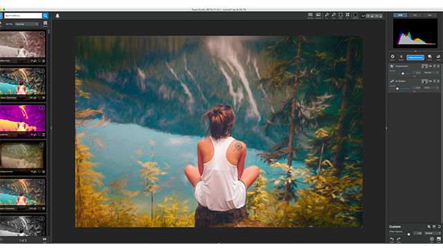
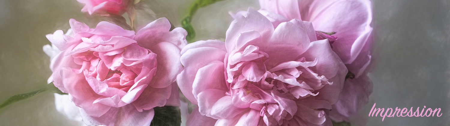
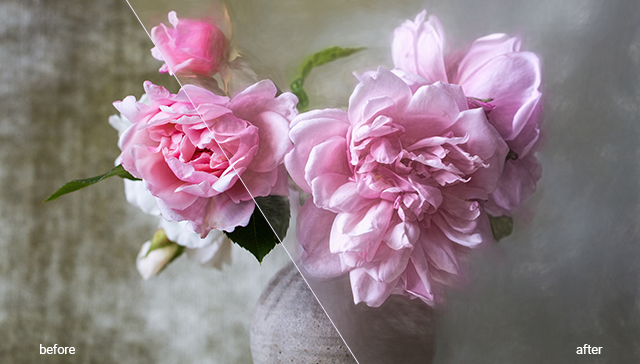
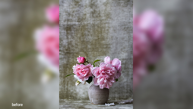
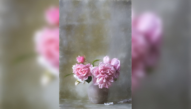
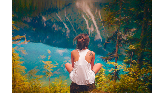
We’re going to start with an image of delicate roses in a vase. The background seems extremely rough in comparison to the flowers. It seems to drown them out to the point that you almost lose how delicate the roses are, and completely miss the rose petals at the bottom. We’re going to soften the background and give the entire image a soft, pastel-like, almost impressionistic, style while accentuating the flower’s colors, and bringing out the petals at the bottom.

We’ll be doing all this with a single pre-saved effect (Pastel ll), two adjustments (Precision Detail and Bloom), and controlling each with masks and opacity.
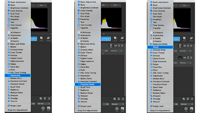
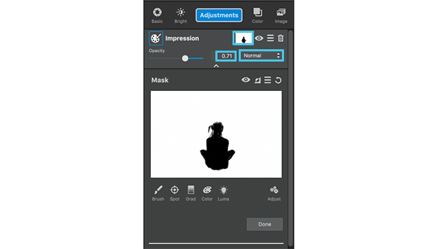
Impression

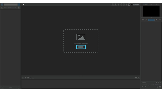
After opening your image (by either dragging and dropping directly into Topaz Studio, or selecting the “Open” button in the middle of the screen), open the Effect Panel on the left side of the screen.

This panel allows you to select from a variety of pre-saved effects created not just by the team at Topaz Labs, but also the artist community of Topaz users. We’re going to go into the “Impression” drop down, and select “Charcoal and Pastel”.

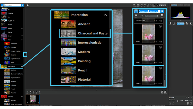
Scroll down the list until you see “Pastel ll” click this effect, and it will be automatically applied to your image.

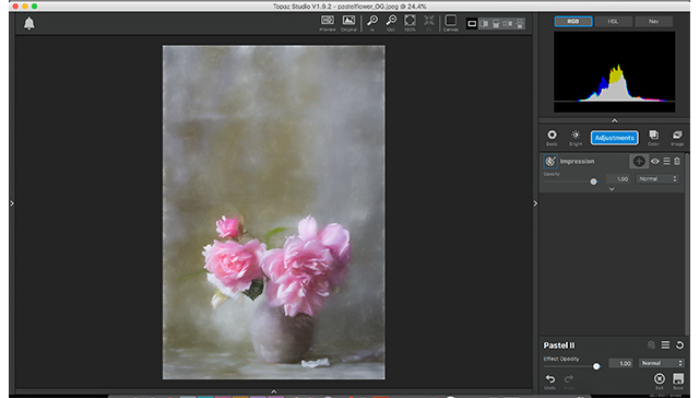
Now we need to personalize this just a bit to bring out the flower’s detail while still keeping them soft and delicate.

We’re not going to change any of the settings, but we are going to play with the mask tool.

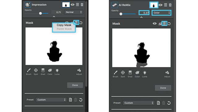
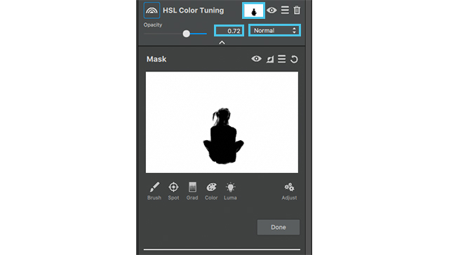
Click the mask icon (the white square between the adjustment name and the eye ball icon) which will open up the masking section options. Click the brush tool, and make sure the black box below it is selected. Now mask out all of the roses, except the pink bud in the background. Make sure you get all the little leaves as well, and don’t forget the petals on the floor!

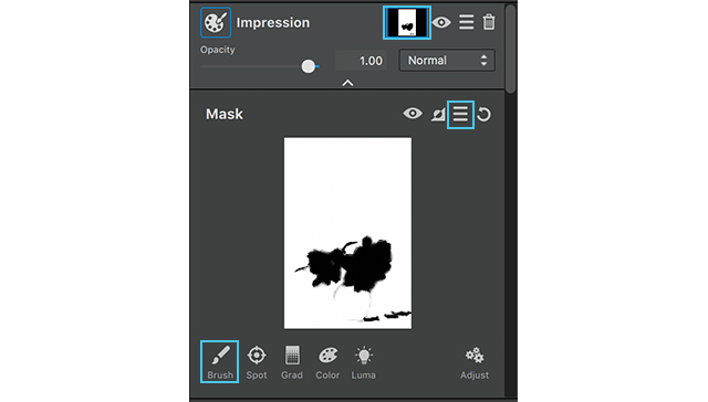
But, we’re not done with this mask yet!

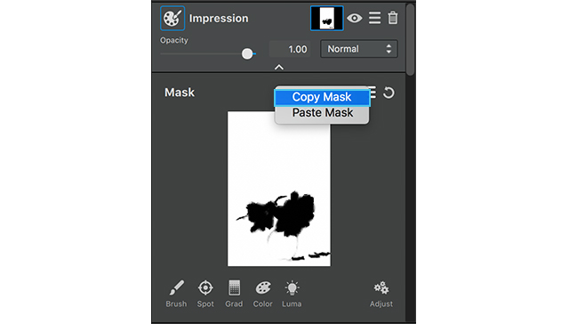
Go to the hamburger menu, between the invert and reset mask, and select “Copy Mask”. We’re about to edit this mask to bring through the softness of Impression, BUT, we need the original mask for a later adjustment. So, we will copy it so we have it for later use.

After copying the mask, click the “Adjust” button (it looks like 3 gears, at the bottom of the masking section) to reveal a hidden menu that allows you to control certain aspects of how your mask is applied.

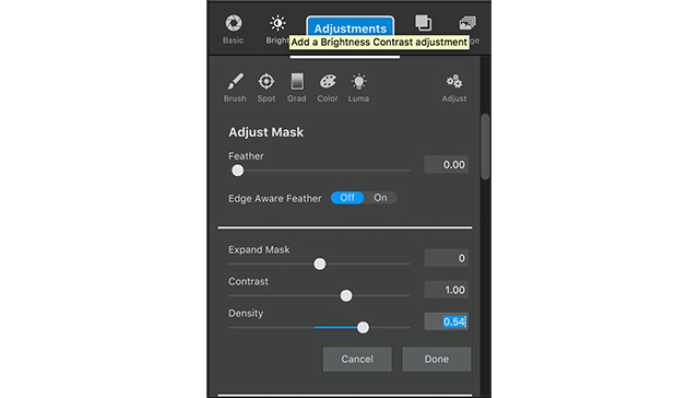
  • “Feather” softens the edges of your mask.
  • “Expand Mask” brings the edges of your mask in, or expands them to cover more of the image than previously selected.
  • “Contrast” controls the difference of lightness or darkness of the mask in relation to the background.
  • “Density” controls the depth of lightness or darkness within the mask.

We’re going to control the density on this occasion and set it to 0.54, then click “Done”.

  1. Density: 0.54

Now we’re going to move on to the next adjustment.
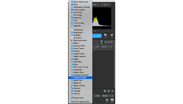
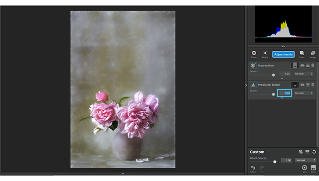
Precision Detail

This is one of my FAVORITE adjustments in Topaz Studio, and I literally use it on EVERYTHING!

I’ll explain each of the adjustments at the end of this tutorial.

Go to “Adjustments” and select “Precision Detail”. We’re only going to edit the “Overall” section in the Detail menu and Lighting at the bottom.

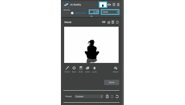
Before we start, I ONLY want this adjustment to affect the flowers. Remember the mask we copied from the previous adjustment? We’re about to use it. Click the masking icon, between the adjustment name and the eye icon, then go to the hamburger menu below in the masking section and select “Paste mask”.

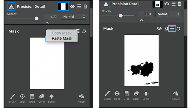
Now, we don’t want this to effect the background, so we’re going invert it by clicking the icon between the eye icon and the hamburger menu in the masking section.

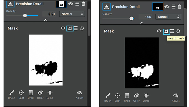
This changes the mask on the flowers to white and the background to black ensuring that the roses are the ONLY things effected.
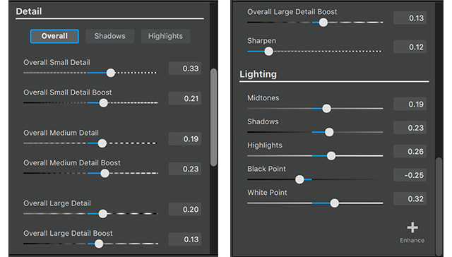
Detail:

  1. Overall Small Detail: 0.33
  2. Overall Small Detail Boost: 0.21
  3. Overal Medium Detail: 19
  4. Overall Medium Detail Boost: 0.23
  5. Overall Large Detail: 0.20
  6. Overall Large Detail Boost: 13
  7. Sharpen: 0.12

This allows the shadows and highlights to really pop in these flowers and brings out details in the folds that weren’t visible before.

Lighting:

  1. Midtones: 0.19
  2. Shadows: 0.23
  3. Highlights: 0.26
  4. Blackpoint: 0.26
  5. Highlight: 0.32

These settings exaggerate the highlights and the shadows a bit more; but we lost a bit of the softness we were trying to keep in this photos. To fix this, go to the “Opacity” setting and bring it to 0.61

  1. Opacity: 0.61

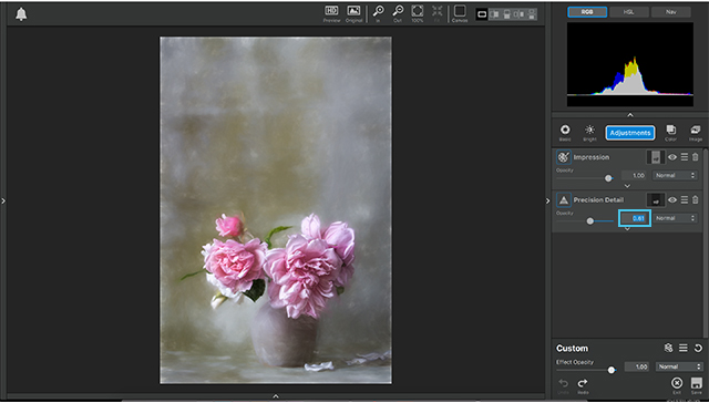
These setting really allow the detail in the flowers to come through, but it still looks a little dark and I feel it could be a bit more ethereal, so we’re going to add the Bloom adjustment.

Bloom

Go to “Adjustments” and select “Bloom”. After making this selection it should automatically open the drop down menu upon application. We’re going to edit these settings to put a little more brightness into the photo; but ALSO give it more of the ethereal feel we’re looking for in this photo.
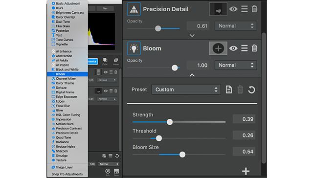
  1. Strength: 0.39
  2. Threshold: 0.26
  3. Bloom Size: 0.54

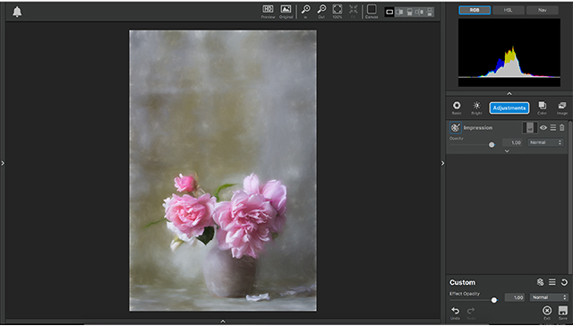
With the addition of that adjustment that completes this tutorial.

Let me take a little time, now that we’re done and explain these adjustments and what exactly it is that they do.

Impression:

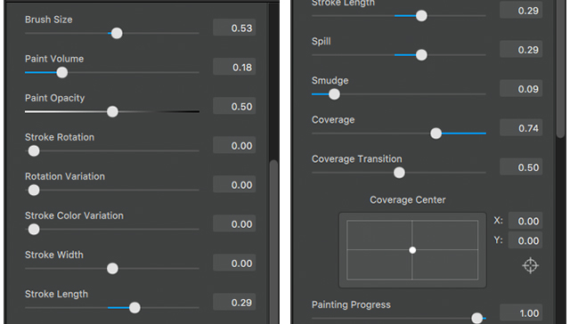
Impression is a very artistic adjustment. From delicate oil paint to rough sketches impression allows you to control your brush size, amount of paint applied, how messy or clean your strokes are, even your painting progress so you can make your image look like a completed painting or like you just started putting paint to canvas. This adjustment even gives additional options to control, the color and lighting of the painting, even add a texture of the “canvas” your image is “placed”. Impression really gives you the freedom to explore your creativity and turn photos into paintings in a snap.

Precision Detail:

Precision Detail hones in and brings out the fine details of your images allowing you to adjust the amount of of small, medium, and large details. This adjustment goes a step further by separately controlling the detail with in the highlights and the shadows Independently, giving your images a more dramatic effect, or toning down overpowering details in your image.

Bloom:

the concept behind Bloom is to soften the lighting in an image. It gives a little bit of ethereal soft lighting to soften a harsh light, or further enhance an already delicate image

Posted on 1 Comment

Creating Imagery Driven by Imagination with Topaz Studio

Today we are going over a few adjustments in Topaz Studio, to show you the creativity and control you can have over your images.

Today we start with this image of a girl sitting on a stump overlooking a river. What we are going to do is make the background seem more painterly, while keeping her realistic. This way it looks as if she was dropped into a painting.

We will be using one helping of Impression, one spoonful of Ai Remix, and one healthy scoop of HSL Color Tuning. We will also be using masks, blending modes, and opacity setting to help control the effects of each adjustment and how it is applied to our photo.

(before)
(after)


Wanna See how it’s done? Watch the video below!


With that being said, lets jump feet first into these edits.

1. Impression

First we’re going to start with Impression. Go to  the adjustments drop down menu and select impression. The VERY FIRST thing I want to do is mask out my girl, this way any effects we put on the photo does not affect her in any way.

So, go to the mask icon, which is the white box in-between the adjustments name and the eye icon, and click it. This will open the mask menu. We’re going to select a slightly smaller brush, keep the masking area white, and the mask its self black. Select the black square, to be sure we have the black MASK OUT brush selected, and color in the girl and her hair. When this is completed select done at the bottom.

Now we’ll get into the adjustment settings.
Select the first brush to apply to this image. I want this to look a bit like an acrylic painting and a little messy.

  1. Number of strokes: Medium
  2. Brush Size: .53
  3. Paint Volume: .18
  4. Paint Opacity: .50
  5. Stroke length: .29
  6. Spill: .29
  7. Smudge: .09
  8. Coverage: .74

Next we will go into the lighting drop down at the bottom of this adjustment menu just to give the image a more vibrant feeling, like you often get with acrylic paint.

Lighting drop down:

  1. Brightness: .-07
  2. Contrast: .19
  3. Highlight: .14
  4. Shadow: -.24
  5. Vignette: .14

We are also going to add a little bit of texture to give this image a canvas feeling to play more of the idea of making this more and more like an acrylic painting in the background.

  1. The Texture we are going to select is in the 3rd row 2nd column.
  2. Texture Strength: .40
  3. Texture Size: .39

Woo!

Now that we are through all of that bring the opacity to .71, and lets move on to the next adjustment.

As you can see this brings an impressionistic feel to the background.

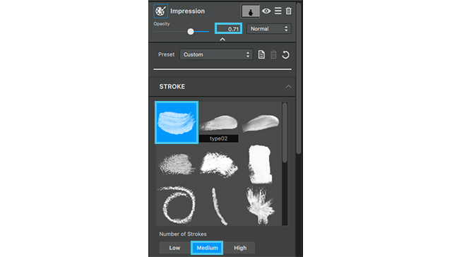
The colors still seem a little muted to me so we’re going to add an Ai ReMix adjustment to add a little bit a texture and bring some life to this color!

2. Ai ReMix

Go to adjustments menu, select AI Remix.
First thing we are going to do with this adjustment is copy the mask from the previous adjustment.

Click the mask icon on the previous adjustment, and select the hamburger menu (in-between the invert icon and the reset icon). Click this menu and select copy mask.

Close that adjustment but using the arrow at the top, and select the mask on the AI Remix. Go to the same hamburger menu on this adjustment and select past mask. This time we are going to add a little bit to this mask. Select a grey brush and brush in the tree stump, that way the Adjustment doesn’t fully affect this area.

After completing this close the masking menu, by clicking done, now we can go into the actual setting of this adjustment.

  1. The style we are going to choose is in the 5th row 2nd column, it looks like a pasture, click and apply. We aren’t going to do too much to the setting, so close the drop down menu and go into the opacity.
  2. We are going to set our opacity to .37 and the blending mode to color.

This allows Ai ReMix to adapt better to the colors of the image and the previous adjustments.

With the addition of the Ai ReMix the look of a textured background is a lot more evident in addition, the color of the water is more vibrant, the yellow of the trees pops (but isn’t distracting), and we even added a bit more green to the mountains across from her. I would still like to play with a few of the colors in the background, to make the seem more painterly, so we’re going to apply an HSL Color Tuning adjustment.

3. HSL Color Tuning

The Final Adjustment is an HSL Color tuning.

We are going to apply the mask from the first adjustment one more time, but since we already have it copied all we have to do is going into the mask menu on this layer, go to the hamburger menu and select past mask.
Now we get to play with the settings of the adjustment.

The colors we’re going to edit the overall color, yellow, aqua, and blue.

  1. Yellow Settings:
    Yellow Saturation: .21
  2. Aqua Settings:
    Aqua Saturation: .35
    Aqua Lightness: .24
  3. Blue Settings:
    Blue Saturation: .39
  4. Overall Settings:
    Overall Hue: .15
    Overall Saturation: .17
    Overall Lightness: -.07

No we are going to go into  the detail settings

  1. Details: .26
  2. Suppress artifacts: .08
  3. Color Sensitivity: .28
  4. Finally go to the opacity and bring it down to .72.

As you can see all these setting make the background mimic an almost impressionistic acrylic painting.

Additional tip:

Since we haven’t had a tutorial on digital frame either I thought I would take the time to add an extra tidbit to this top tip.

Now I’m going to do a pretty simplistic frame with the default setting because I like the way it fits the photo, but what I am going to go in an edit is the texture around the frame.
We are going to select 2nd texture out of the 1st row, this is actually one of my favorite textures in studio as a whole so I tend to lean toward it often.

After selecting this texture we are going to go down to the color setting, because I want the colors of the frame to play more off the blue of the water; and instead of picking a frame that mimics the color we’re going to edit the color of this frame to our liking.

So go to the frame color setting menu at the bottom and set them to the following:

  1. Frame brightness: -.22
  2. Frame contrast: .27
  3. Frame Detail: -.26
  4. Frame Saturation: .25
  5. Extra color strength: .88
  6. Extra Color Hue: .57

As you can see this just adds an extra touch to our image to give it more of a professional presentation

Well thats it for this Topaz Studio tutorial! Join us next time to see what you can learn.